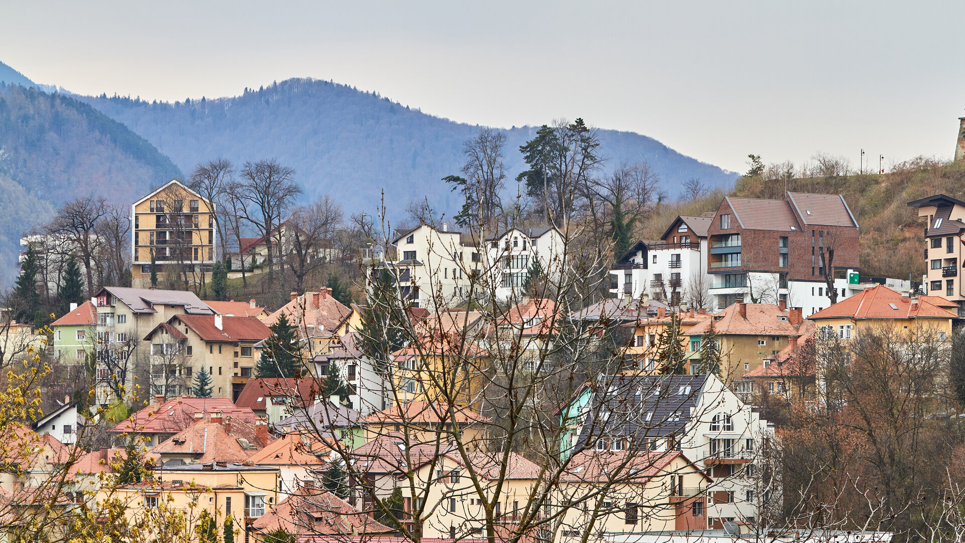
Maior Cranta apartment building
Authors’ Comment
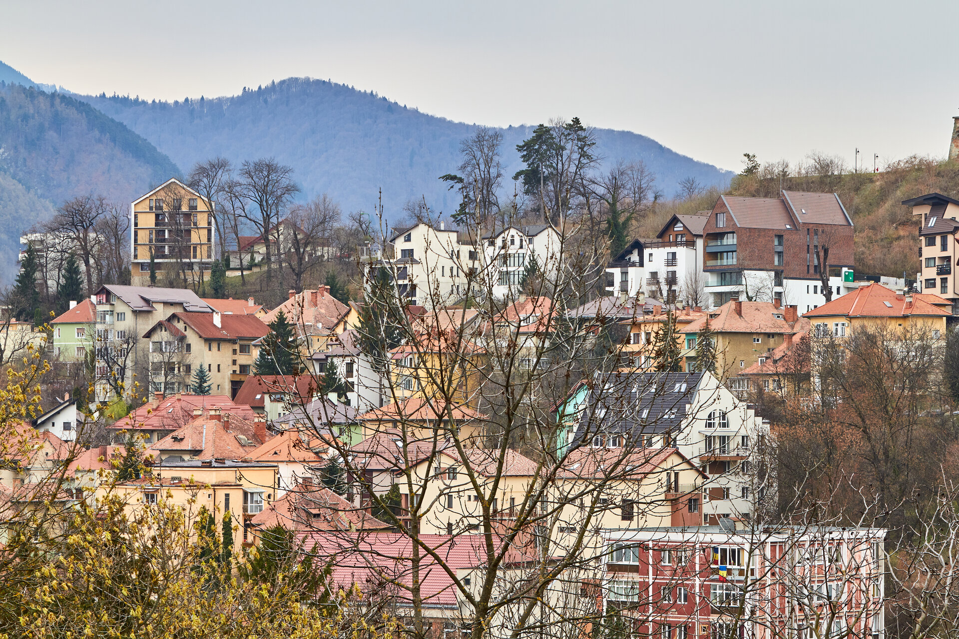
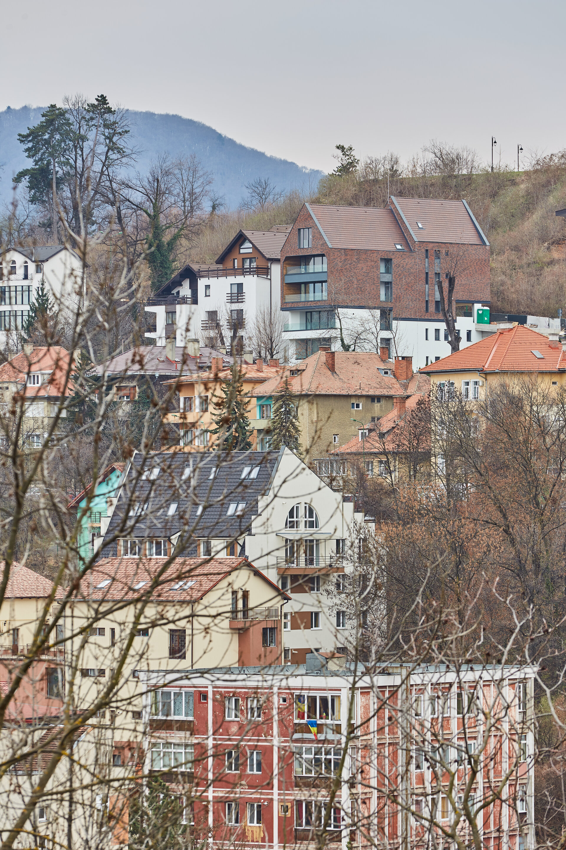
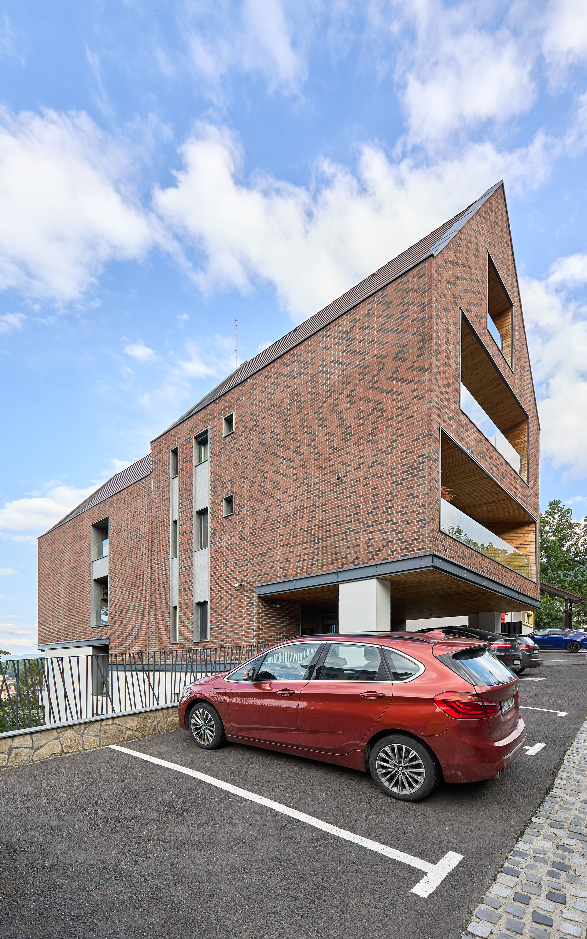
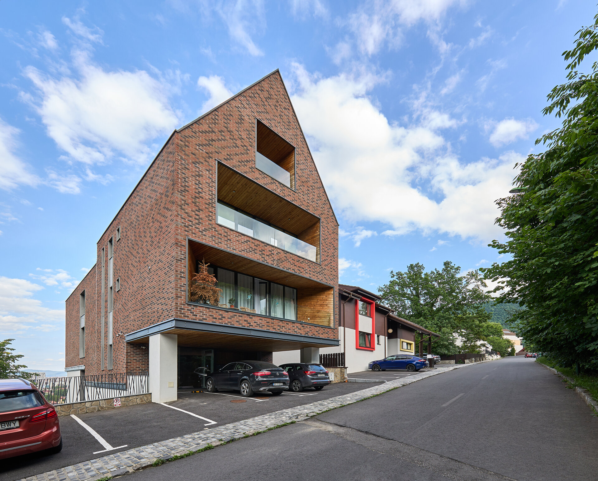
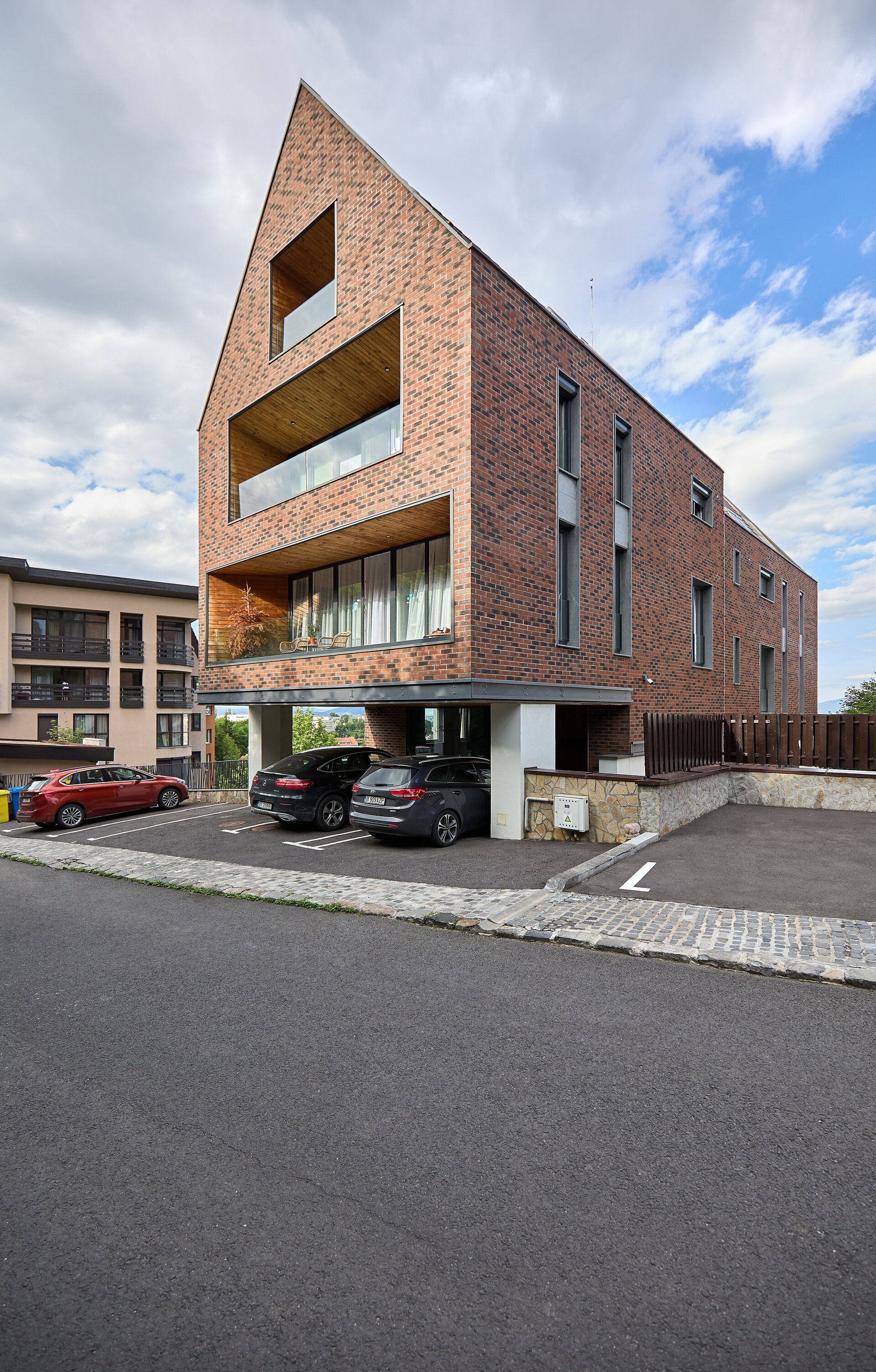
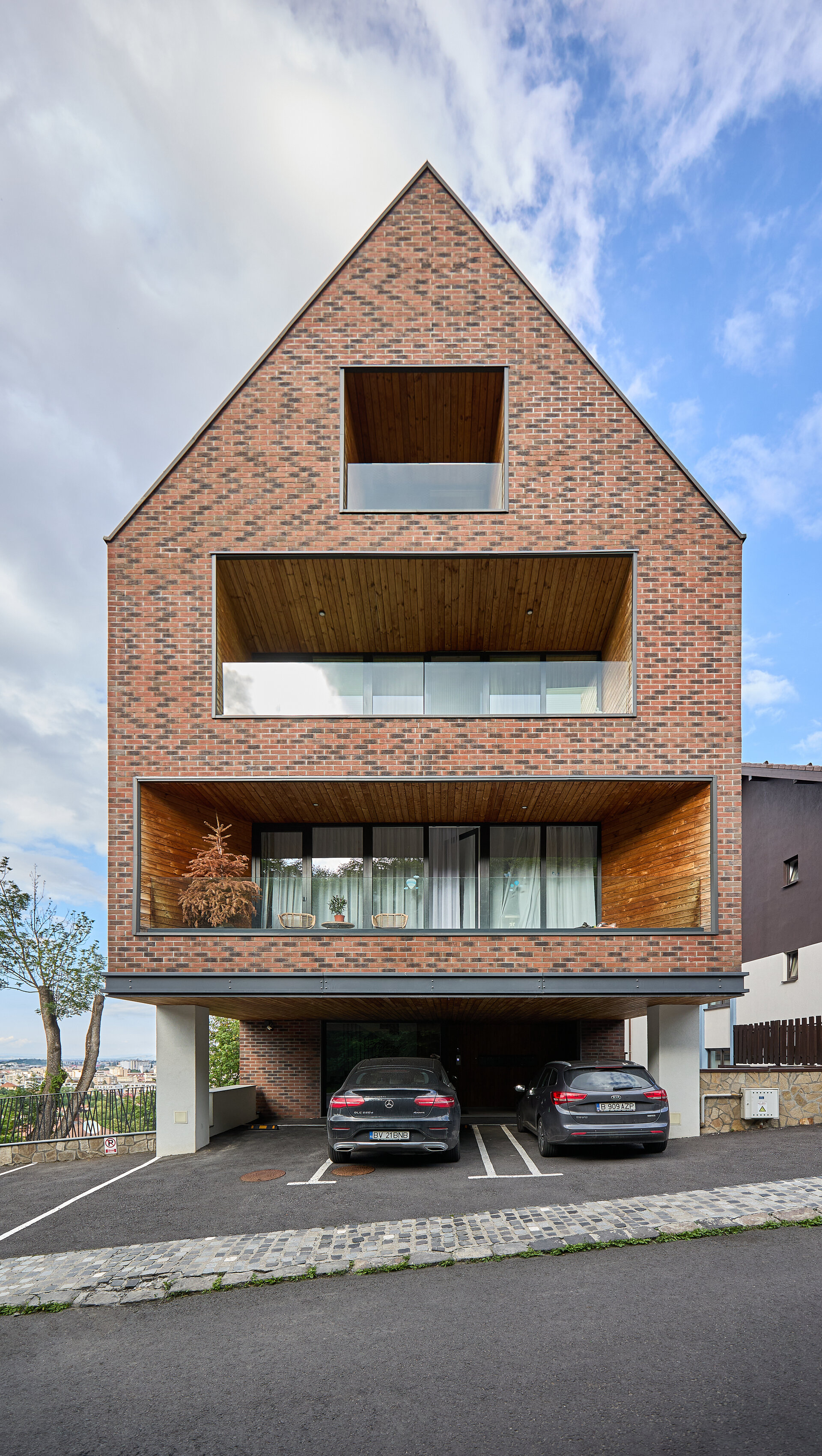
The simple, wagon-type silhouette of the construction, specific to the region, spreads over the depth of the plot, integrating itself into the urban fabric in an unostentatious way, the goal being to capitalize on the positive aspects of the site.
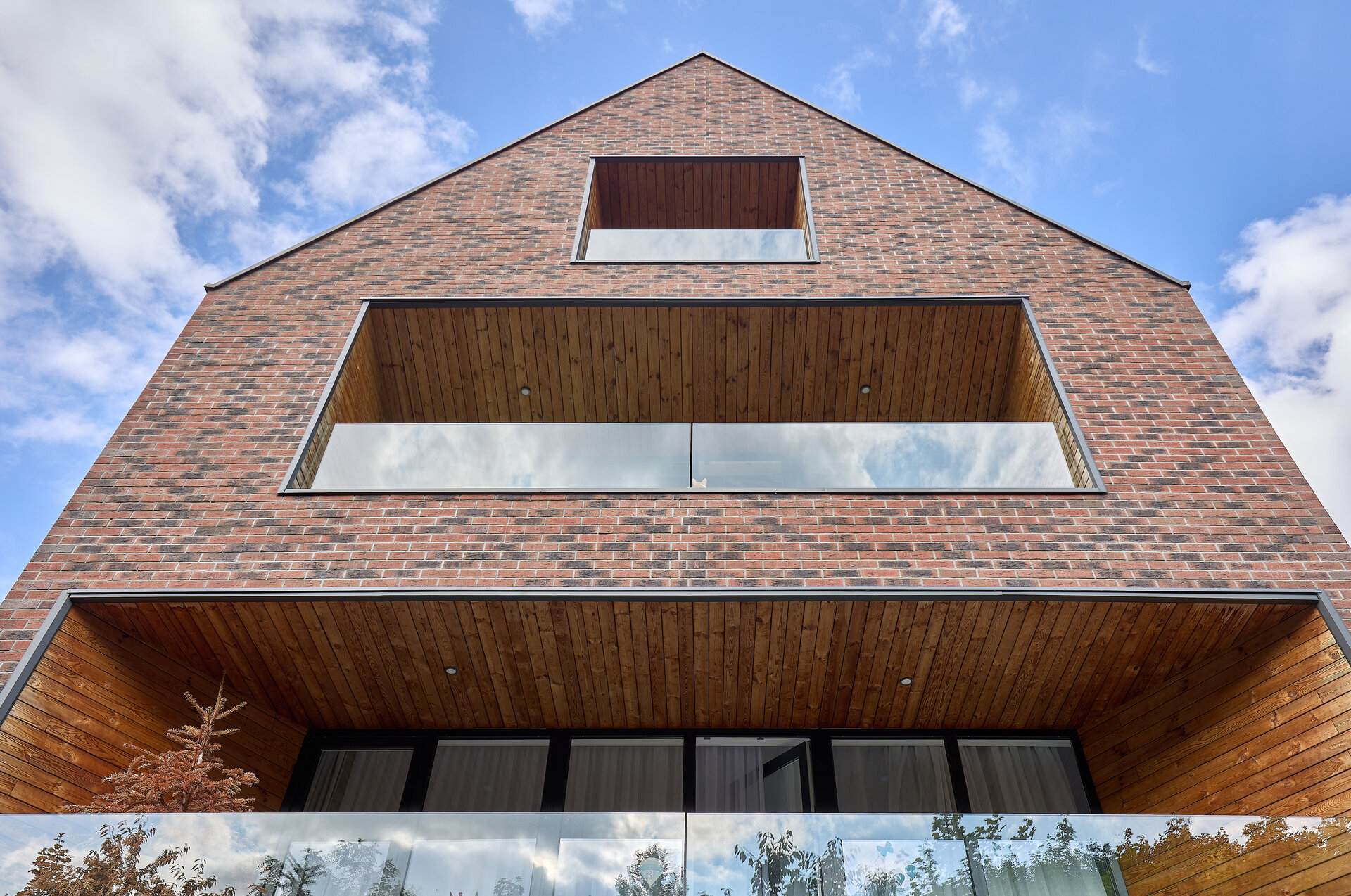
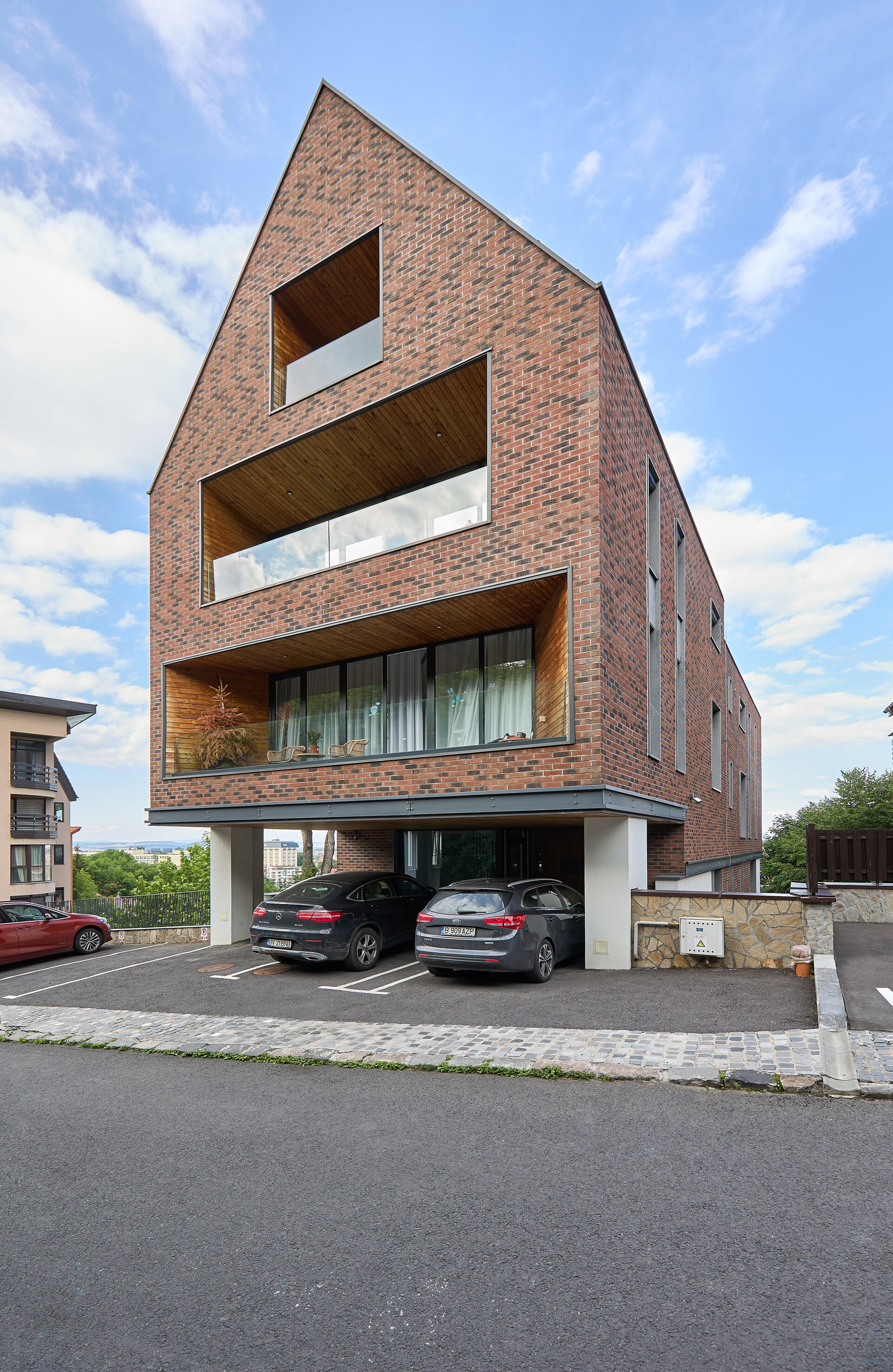
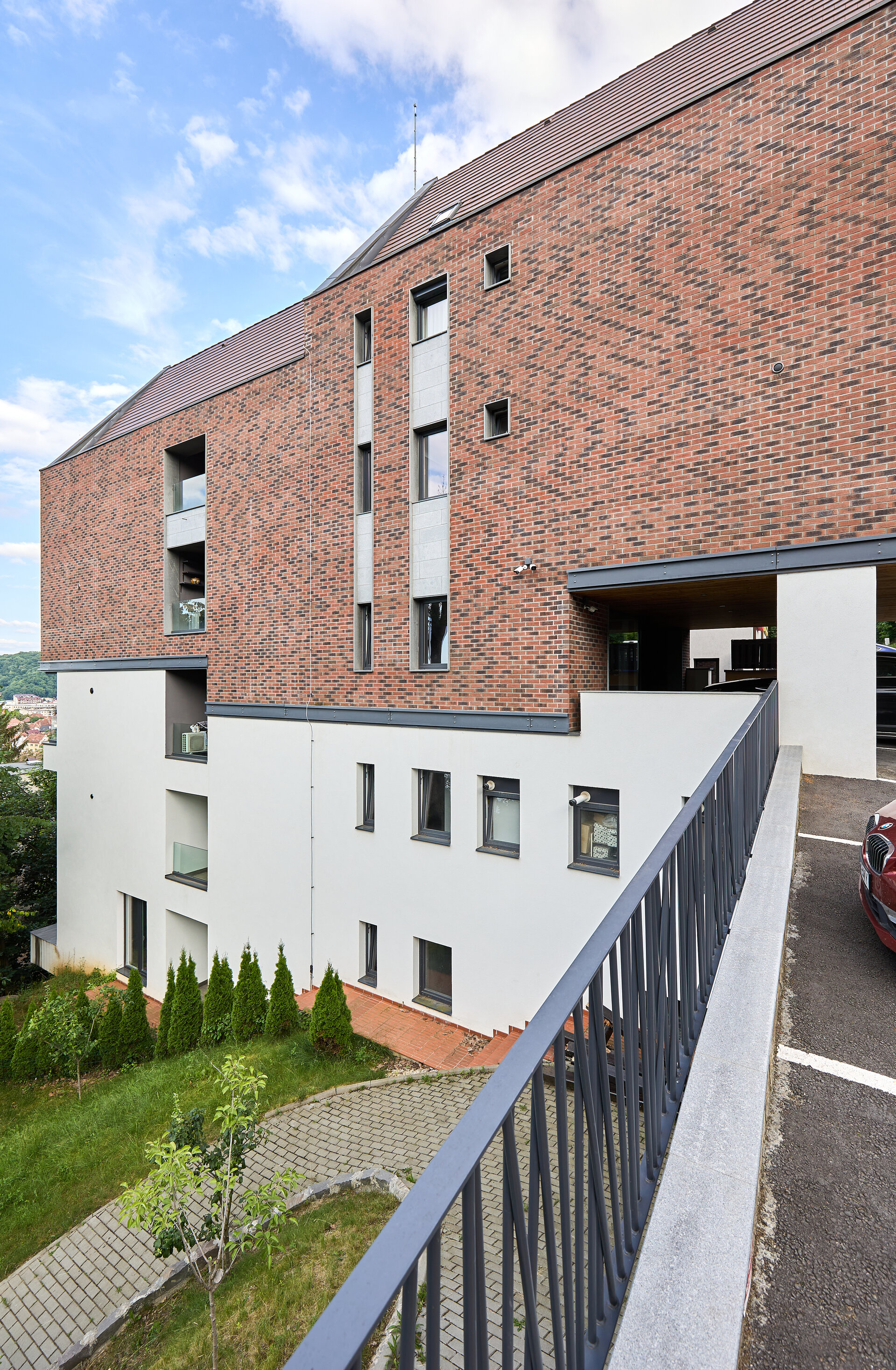
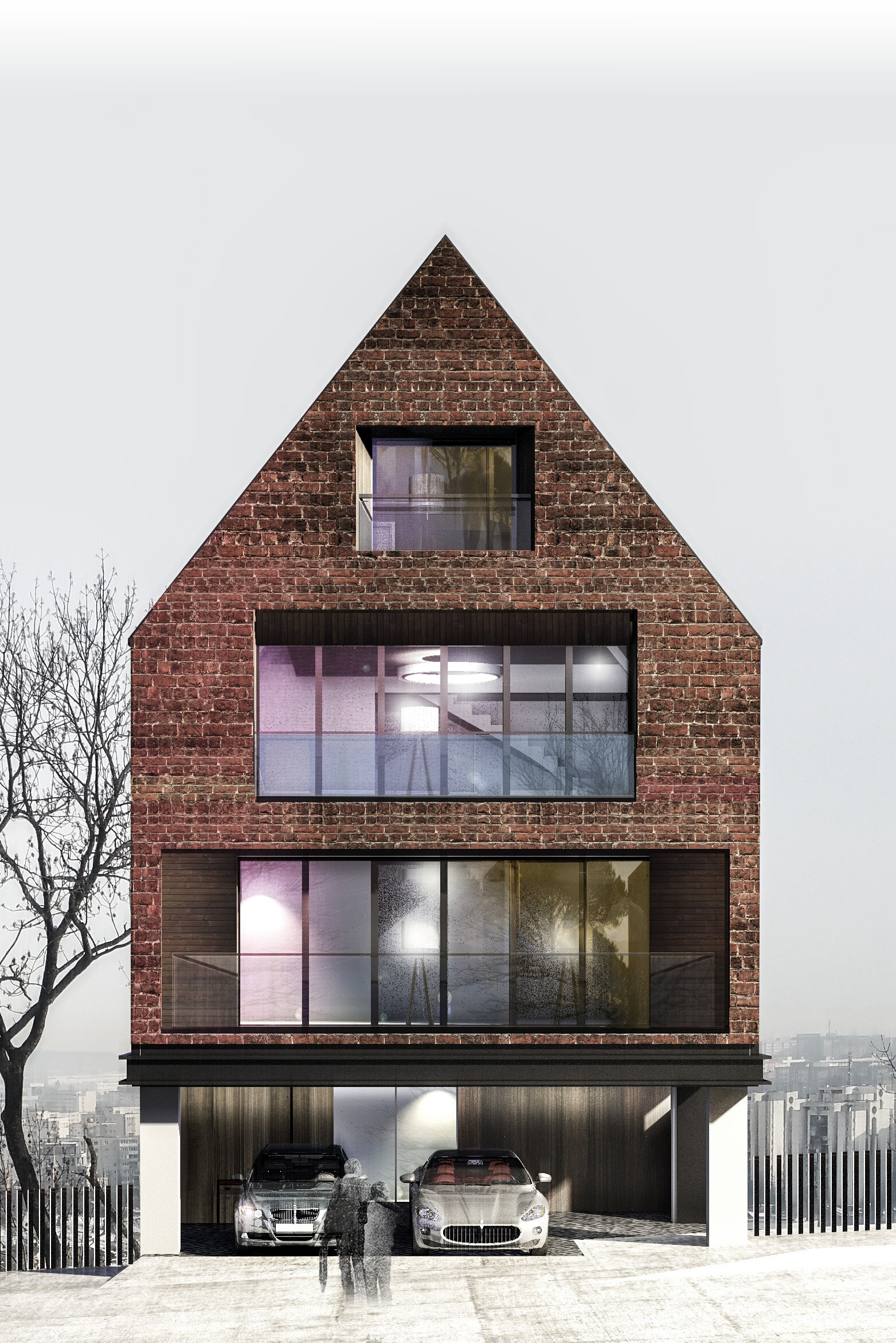
The building is divided into two registers, by the means of the chromatics and the finishes that are used. The brick masonry and the tile covering create a unitary volume, which develops from the ground floor upwards. This volume is placed on a white base, composed of the two basements, which makes the connection with the rugged terrain.
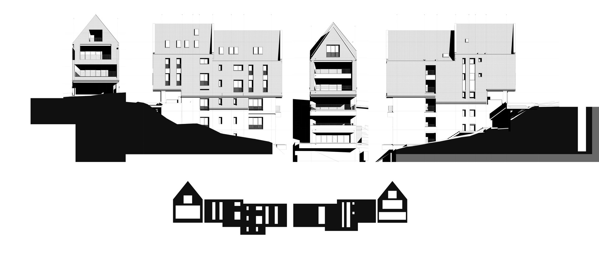
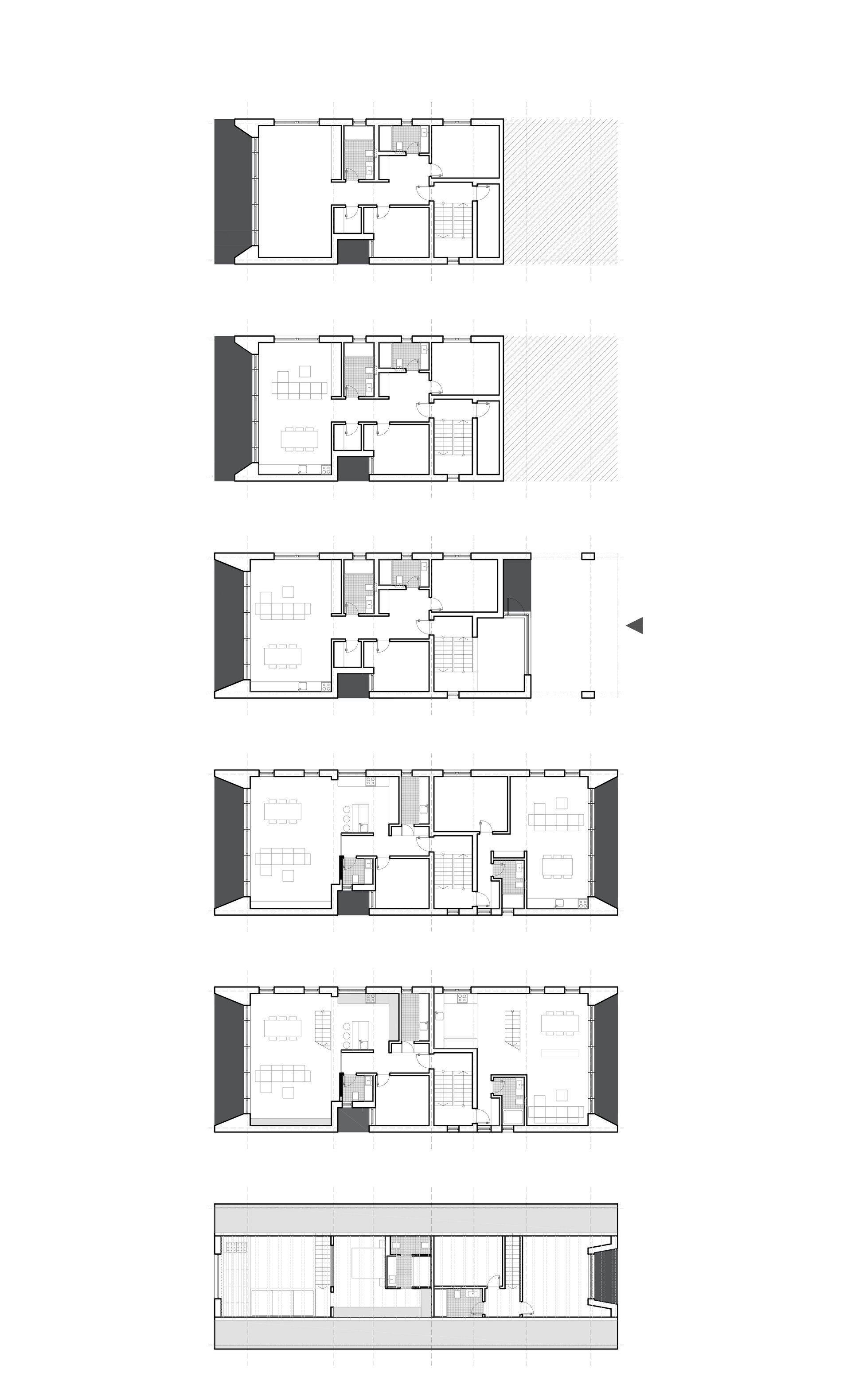
The slope of the land exceeds 2 levels and to mitigate the impact towards the valley the lot is divided into half levels.
The ground floor connected to the Maior Cranta access street retreats into the access area, forming an articulation between the base and the upper volume. The buffer zone thus obtained protects the access to the house, creating a visual continuity between the interior and exterior.
The composition of the facades is dictated by the balanced play between openings and closures. The facade to the street is a suspended volume with one important opening per level. These openings are variable in height and width, ensuring the sculptural appearance of the building. Towards the valley and the view of the city, the full/empty ratio of the facade is in favor of glazed surfaces.
The windows without parapets and the glass balustrade further open the interior to the city.
- Avalon Estate
- Marmura Residence
- Colina Lac Residence
- Apartment Building on Virgiliu Street
- Stejarii Collection Residential Complex
- Maior Cranta apartment building
- Dynamic Residence
- Brick House
- Residential Building in Northen Bucharest
- Lake House 2
- Str. Sergent Nuțu Ion 2 - residential building
- One Verdi Park
- Uranus Apartments
- The Corner Armeneasca CN
