Chili’s Romania
Authors’ Comment
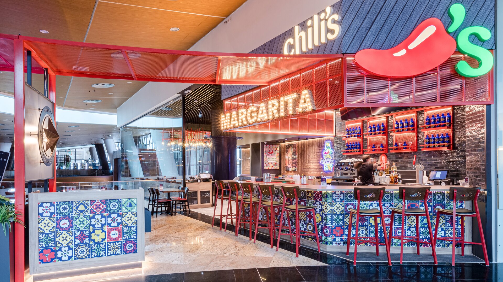
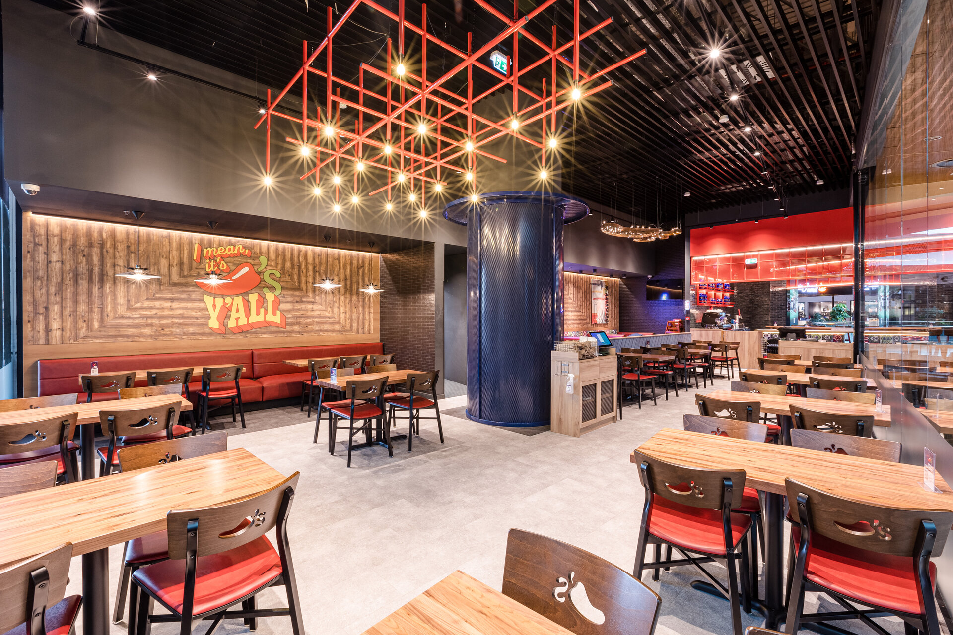
**Chili’s Romania** marks the American brand’s debut on the European market, with a full-service restaurant located in Băneasa Shopping City, Bucharest. Covering approximately 340 sqm and accommodating 140 guests, the project started from the challenge of integrating a complex restaurant programme within an existing shopping mall space, while preserving the brand’s informal and expressive character.
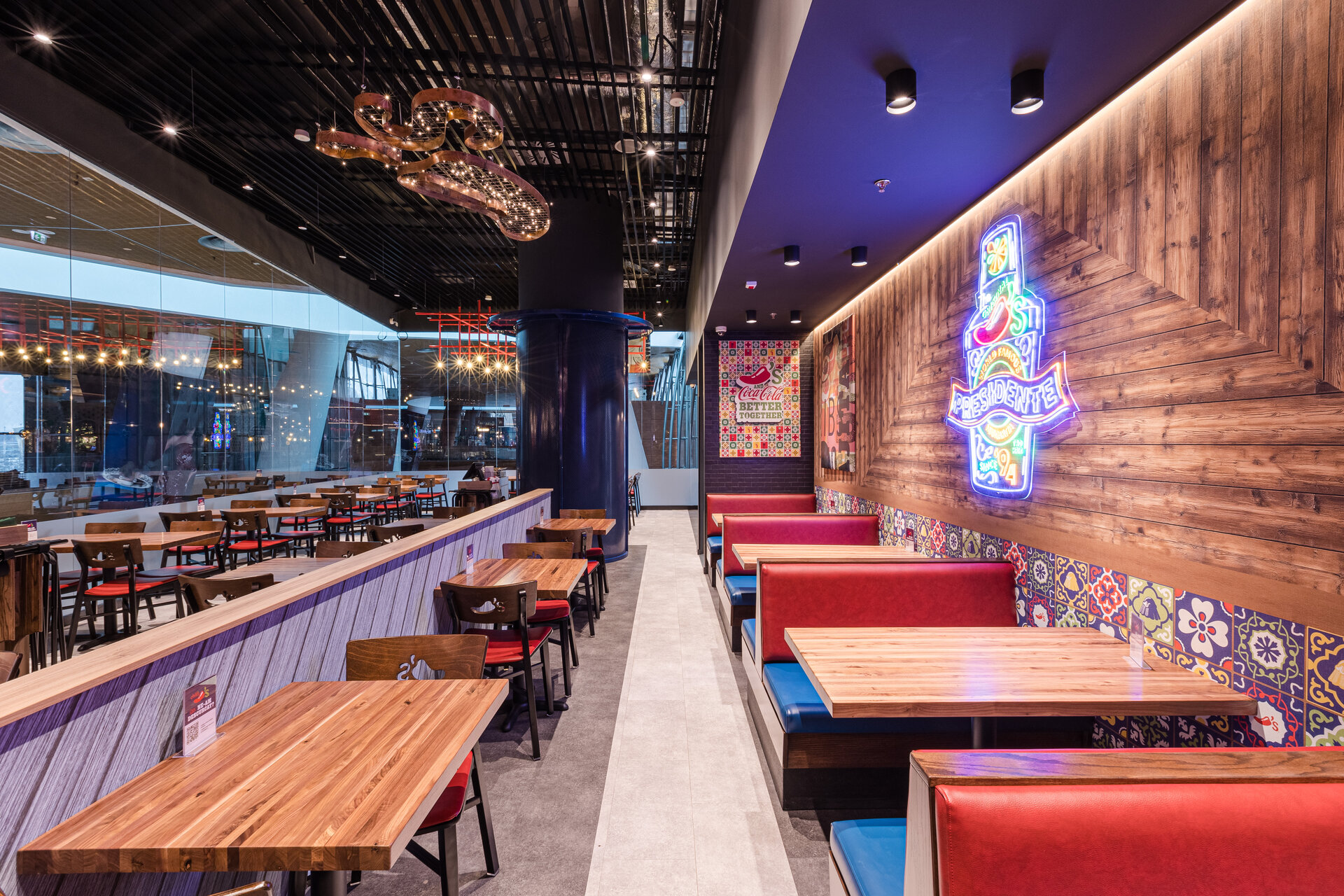
The design draws from Chili’s distinctive visual language and translates it into a semi-industrial interior, where metal, timber, raw-looking surfaces, and graphic elements are combined with warmer textures and details. Texas and Mexican influences are not treated as a thematic décor, but are introduced selectively through materials, colour, graphics, and objects, contributing to the overall atmosphere of the space.
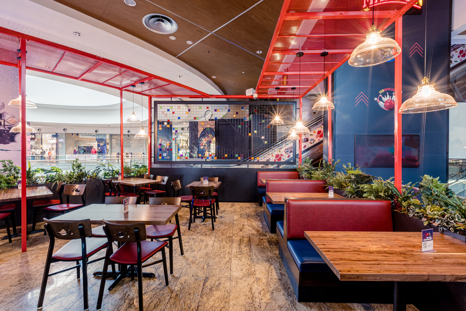
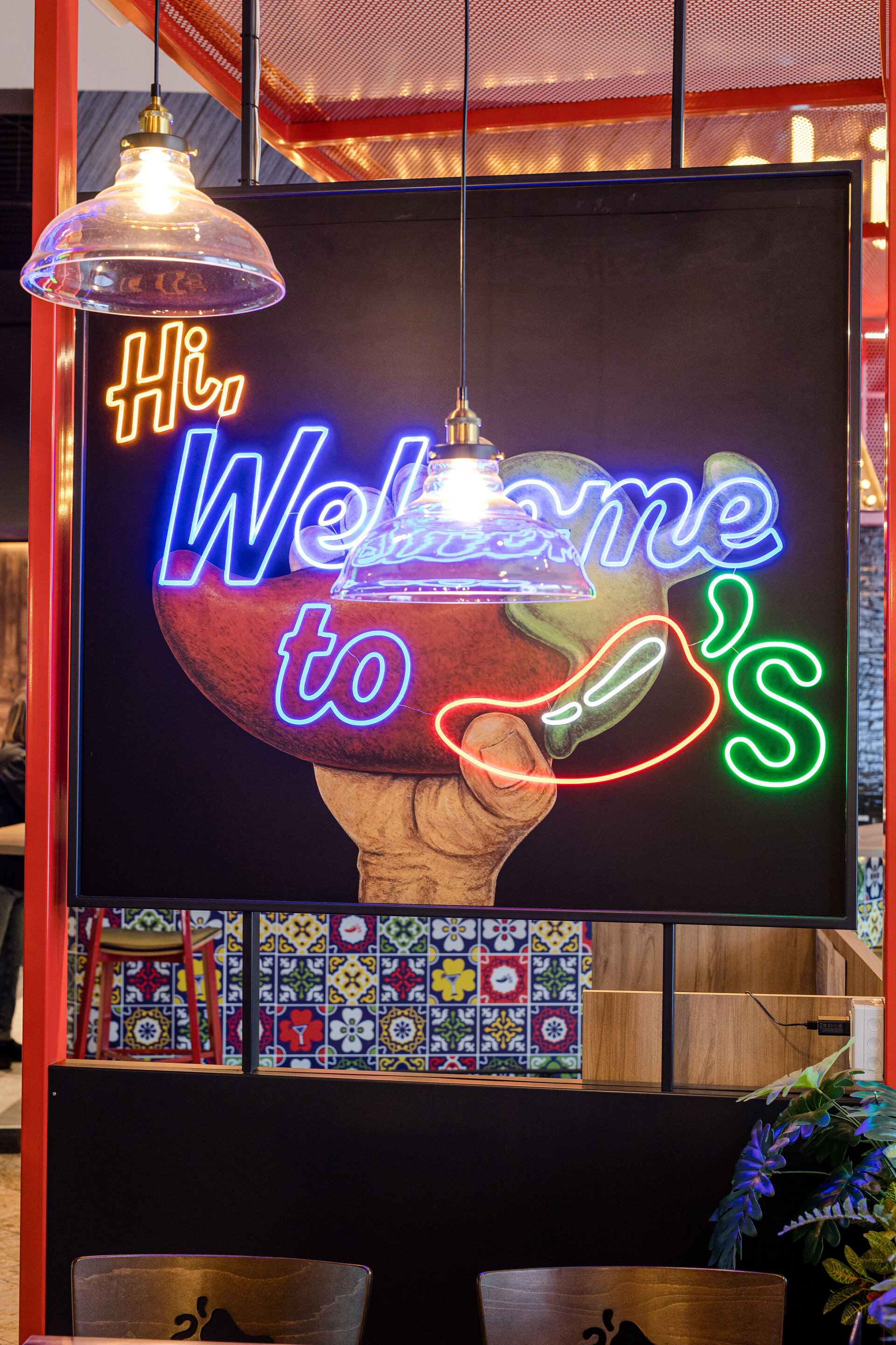
An important part of the project was finding a balance between the identity requirements of an international brand and the specific characteristics of the existing space. Branding elements were integrated into the interior architecture and furniture, becoming part of the spatial composition rather than simply being applied afterwards. The logo, graphics, lighting fixtures, and decorative objects are distributed throughout the interior to create focal points and gradually build the restaurant’s atmosphere.
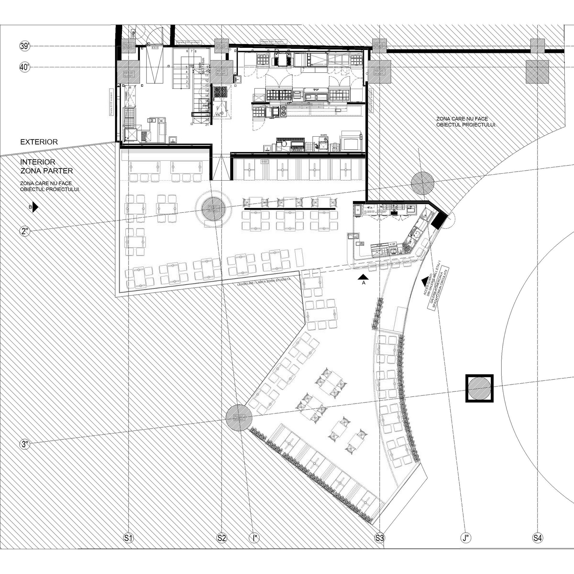
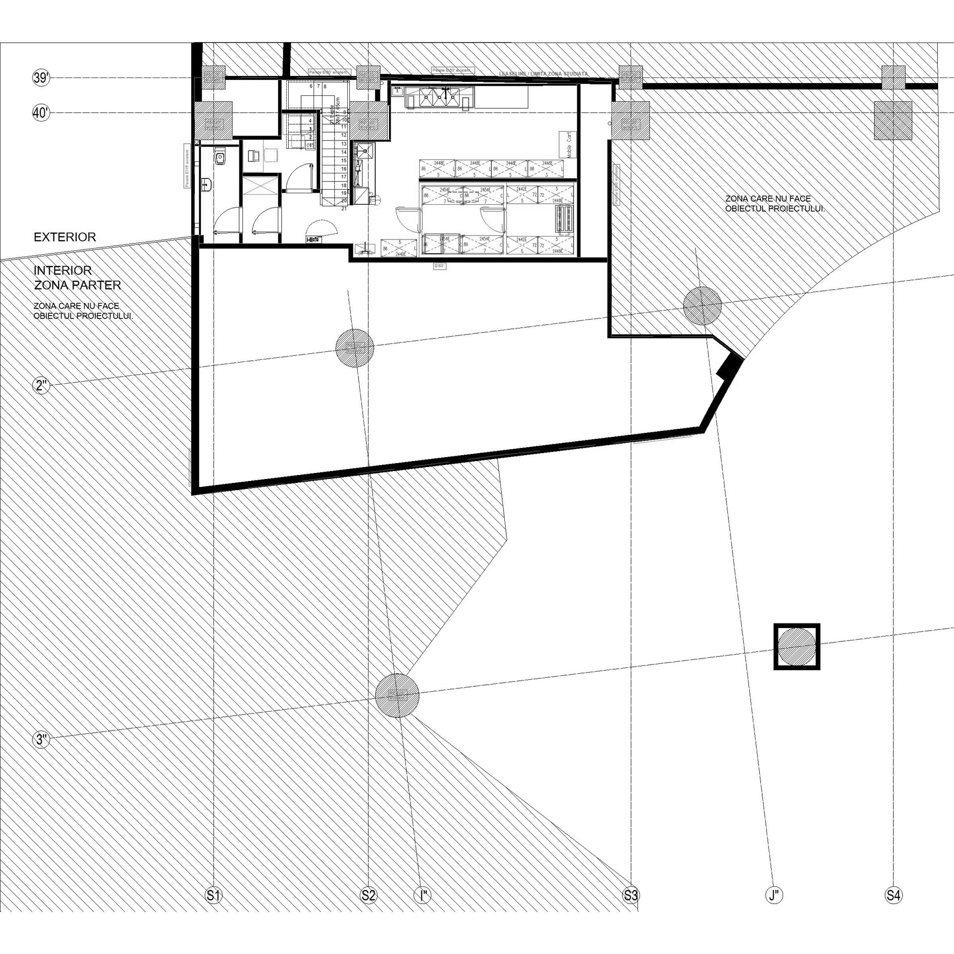
The 140-seat layout is organized as a sequence of areas with different characters, ranging from individual tables and group configurations to more compact seating areas suited to periods of high traffic. Furniture placement and circulation routes were studied together with the positioning of the bar and access points, allowing the restaurant to operate efficiently without allowing operational requirements to dominate the dining environment.
A particular challenge was the kitchen configuration, arranged across two levels, which required careful coordination of supply, preparation, and service flows. The relationship between the kitchen, bar, dining area, and staff spaces was resolved so that technical circulation remained as discreet as possible in relation to the customer areas.
Materials and details were selected to reinforce the same idea of controlled contrast. Metal surfaces and industrial elements are balanced by timber and more tactile finishes, while graphics and colour accents punctuate the space without visually overwhelming it. Furniture, lighting, and decorative elements are treated as part of the overall architectural composition, contributing both to the identity of the restaurant and to the scale and comfort of the dining areas.
The project involved the complete development of the interior, from concept and interior design through architecture, multidisciplinary coordination, technical documentation, procurement, and implementation. One of the main objectives was to maintain consistency between the initial concept and the built result, within a project where numerous components—from finishes and furniture to branding elements and technical details—had to be coordinated in accordance with the franchise’s international standards.
The result is an interior that does not attempt to reproduce an existing model, but instead creates a local interpretation of the Chili’s experience. The brand identity remains clearly recognizable, while being expressed through architecture, materiality, and atmosphere, within a space adapted to the practical conditions of a hospitality project located in a shopping centre.
HoReCa Design
- Panoramic - cable car station, restaurant, events, bar
- Eggcetera
- Chariot Café
- FICO — café, restaurant, bar
- Millennium Hub & Hotel – Designer Suites
- Speciality Coffee Shop - Mereu
- Niu. Beach
- Tărâm - dwelling TR_1
- Tărâm - dwelling TR_2
- Büffė.35
- NOON
- The Urbanist
- Control Club
- Munchies and Cream
- Chili’s Romania
- Trickshot Promenada
- Stejarii Restaurant
- Home Spa
- Farina Homemade Pasta
- Room4 Coffee Yard
- Orizont Hotel Predeal, Refurbishment of the Common Areas
- Hype Roll
- Little Kitchen Bistro
- Cantemir Hotel


