Colorbitor Office
Authors’ Comment
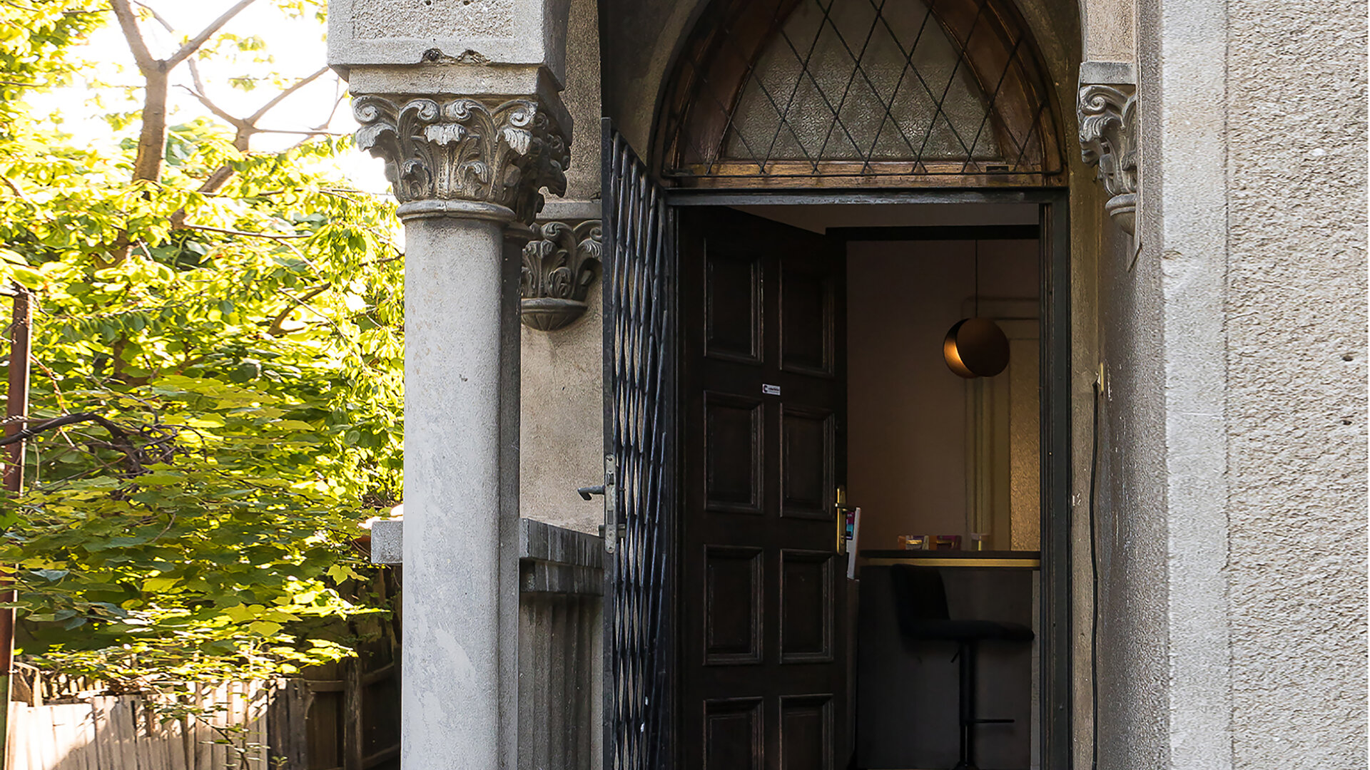
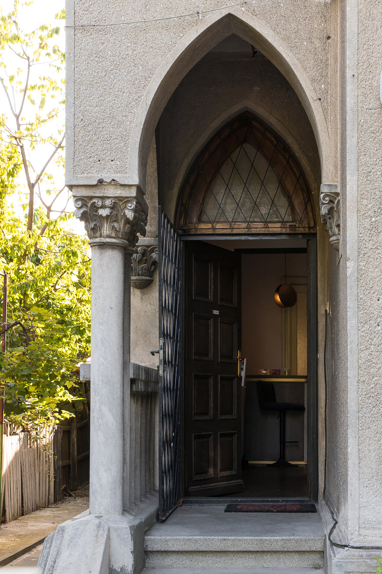
The design theme involved the interior design of a residential house converted into an office. The clients, the two founding partners of the company, introduced us to the universe of their brand through a very well developed communication strategy. The key word taken from their presentation was courage, fierceness.. The main request was to to express professionalism, idea found in the predominantly serious atmosphere, of clasical inspiration, with small hints of their creative, fun character. They gave us complete free rein of the concept so that their new headquarters transmita to visitors the essence of their company.
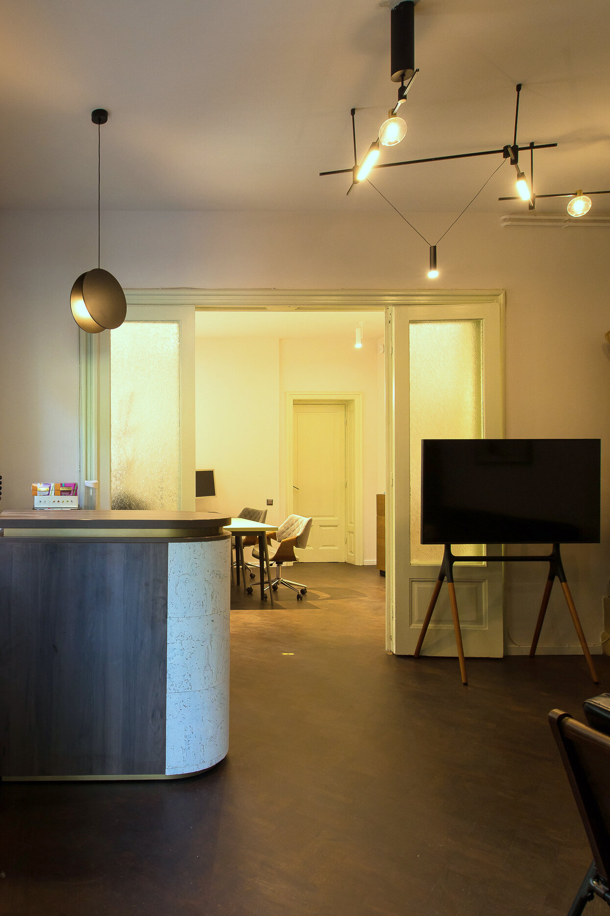
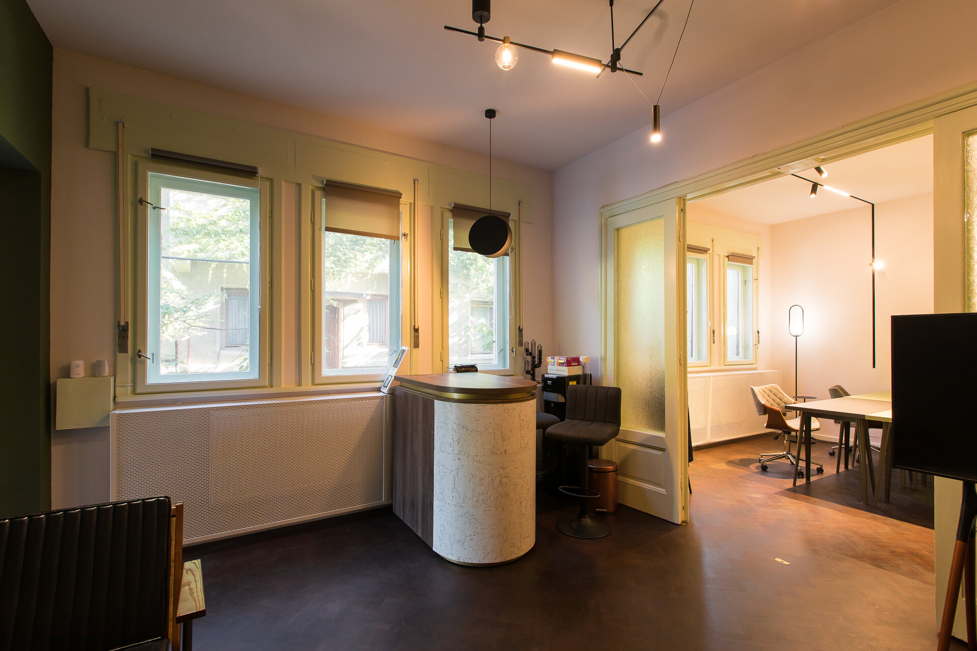
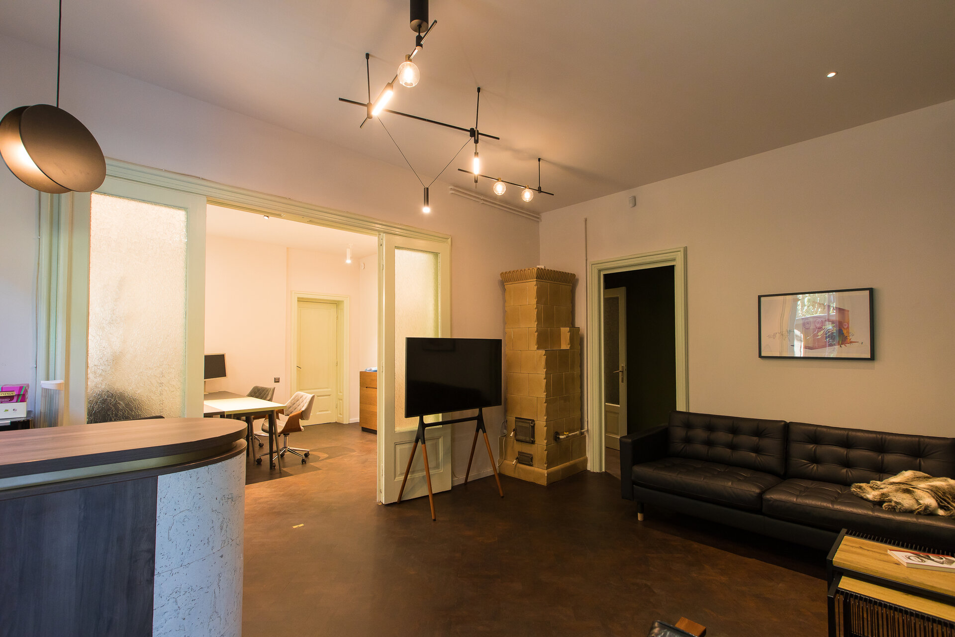
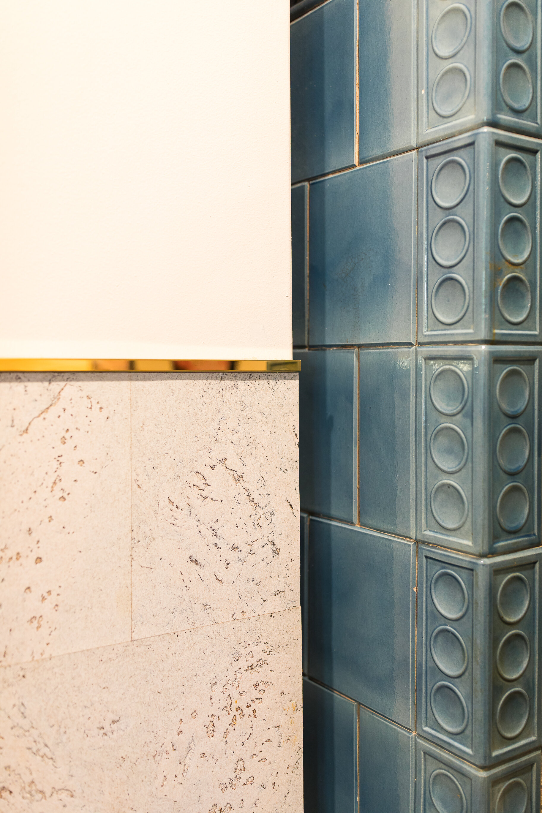
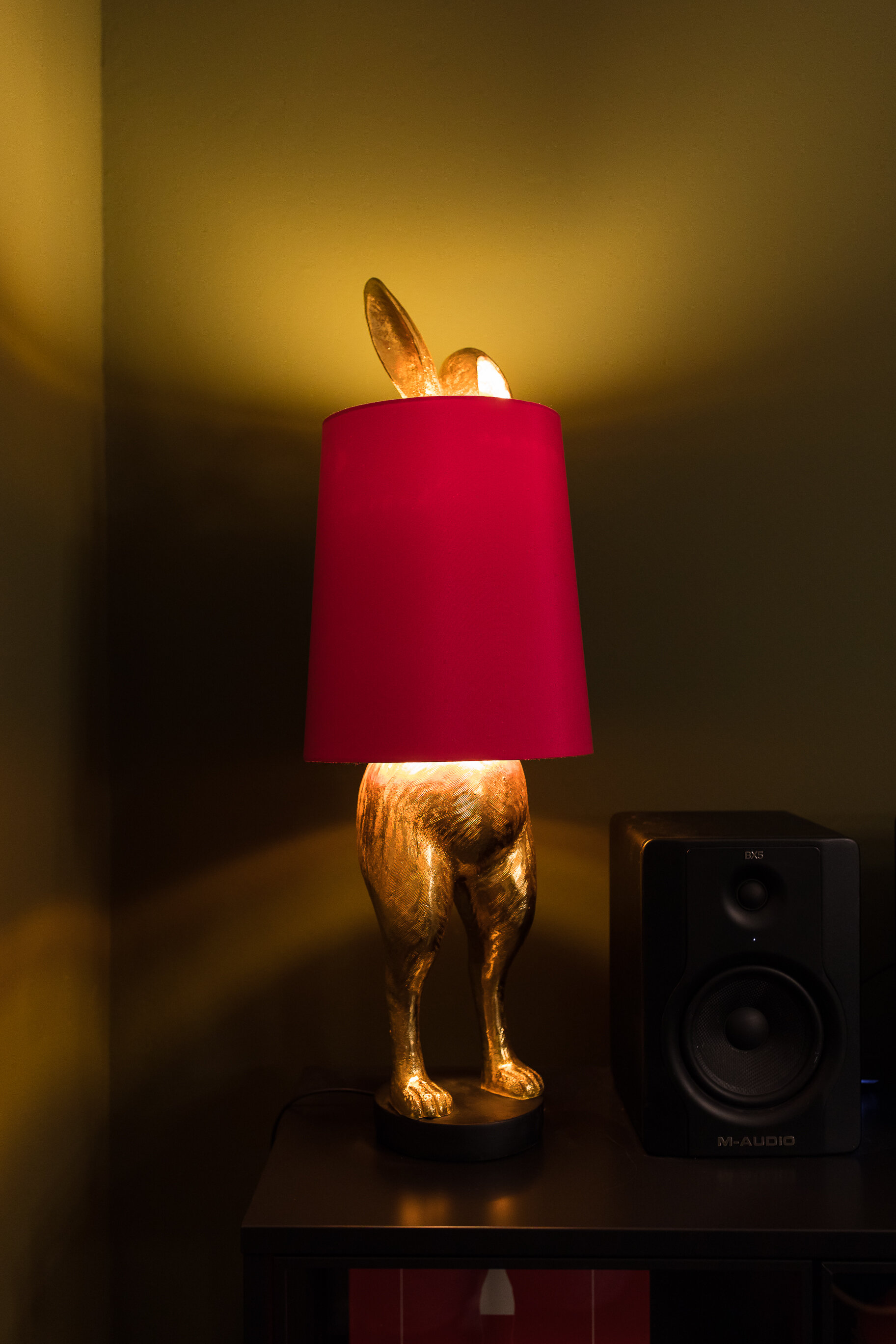
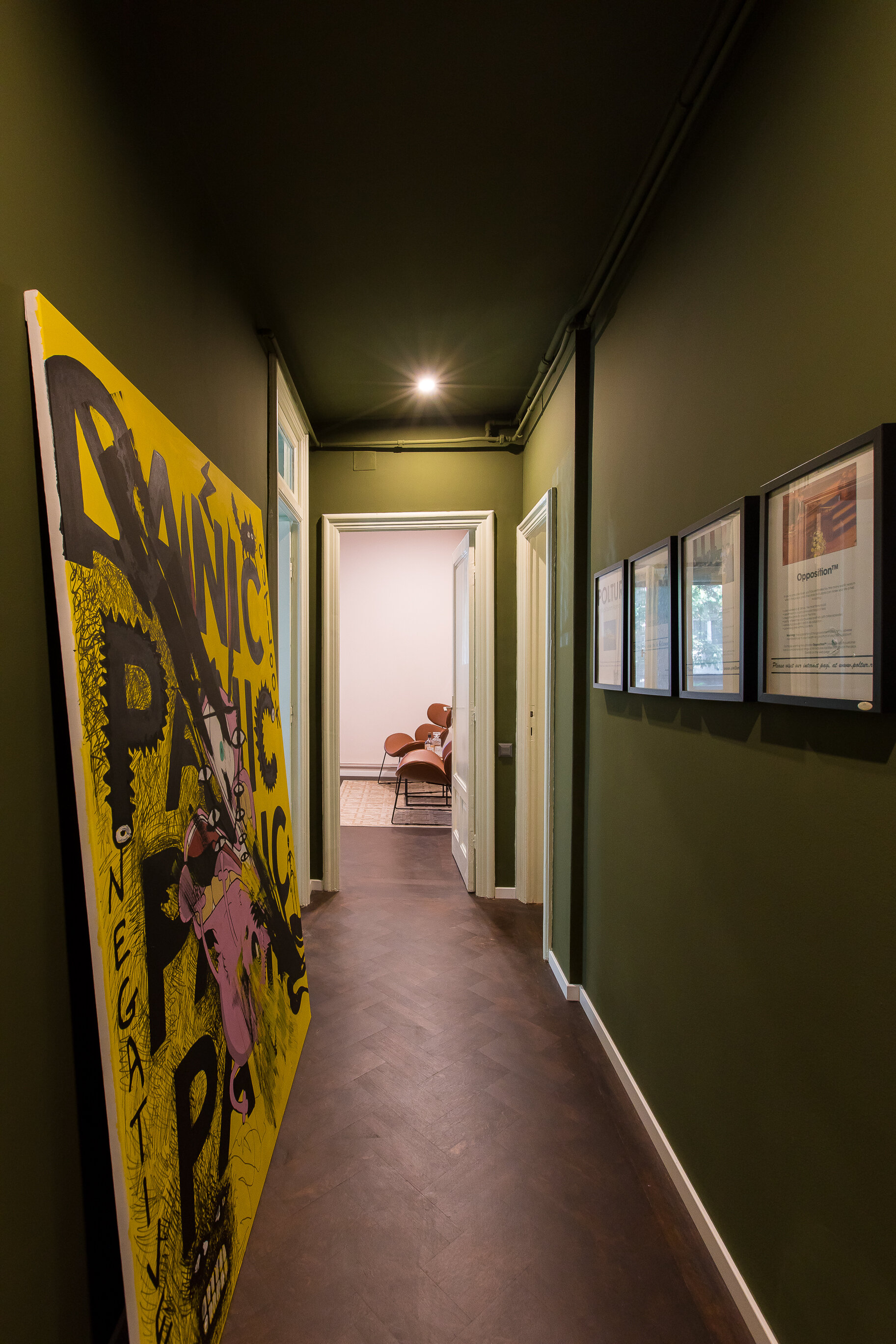
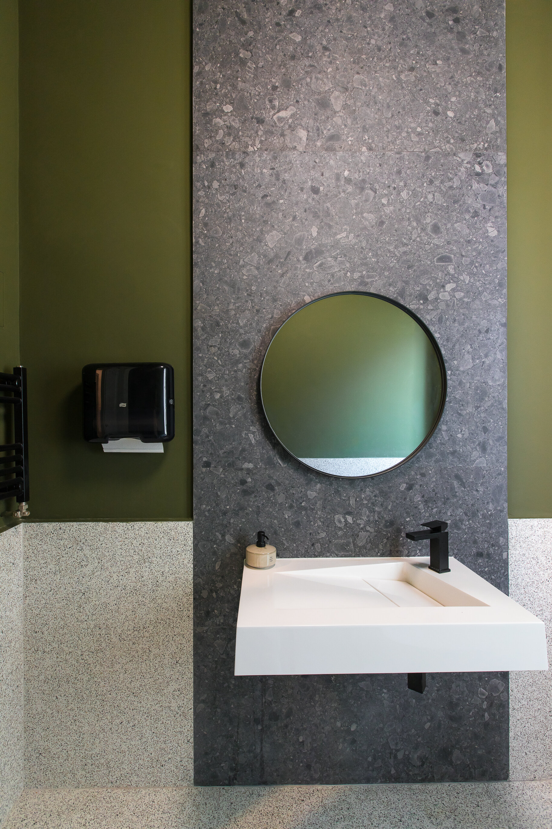
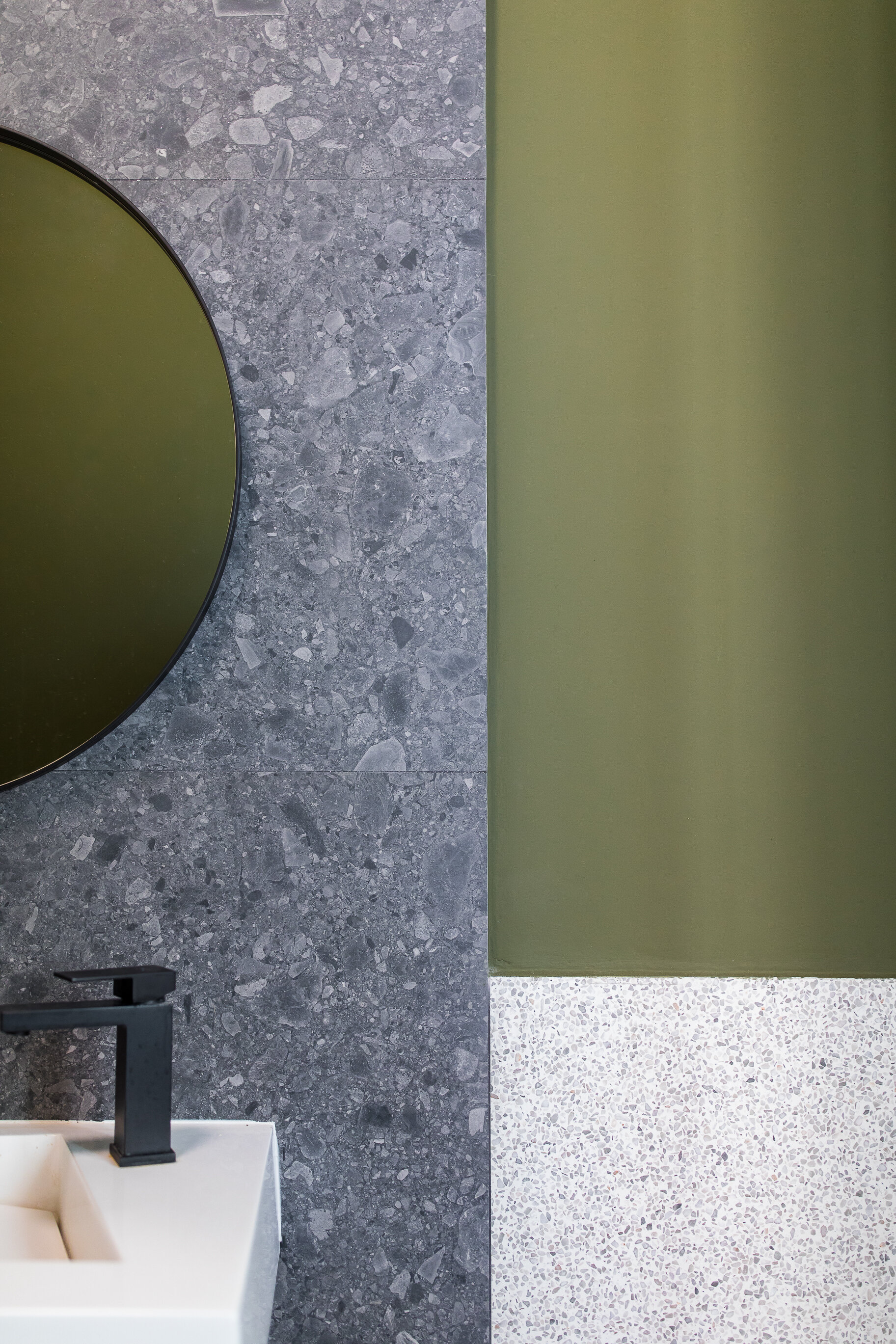
We started from a classic combination in order to inspire seriousness through colors, textures and pieces of furniture. This had as a general base of intense textures of walnut wood, balanced by natural textures such as stone and cork. We added strong black accents and gold metallic ones as a binder, to give an elegant touch. The serious color palette of browns, beiges and blacks is softened by dark and light green tones. We have also provided the release of a personal touch as well through the various art pieces and posters.
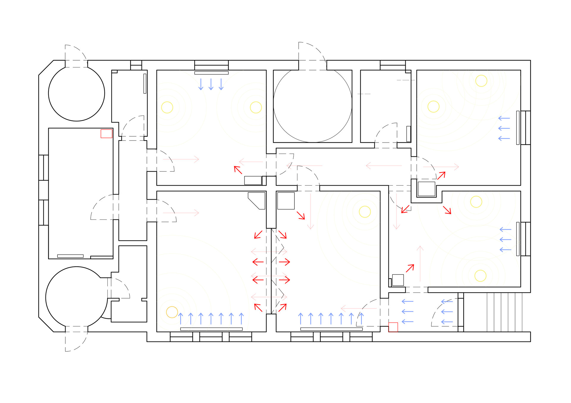
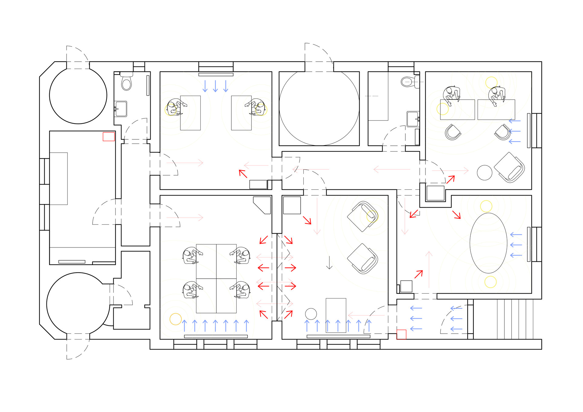
The positioning of the main rooms on a circular route inspired us to imagine a tour for visitors of the office and of the company worksflow. Thus, on a schematic plan of the circuit, we have established the strategic location of some elements as perspective ends that will attract people and make them continue the route. Also, considering the long time spent at work, we found it important to also relly on feng-shui principles. We looked for the control positions for each work or relaxation area, so that all people feel comfortable.
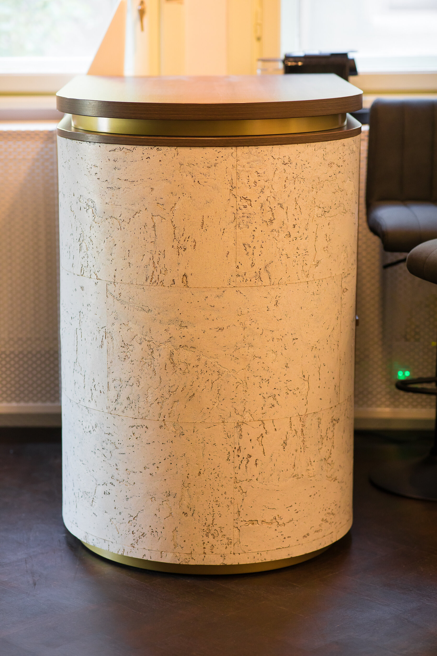
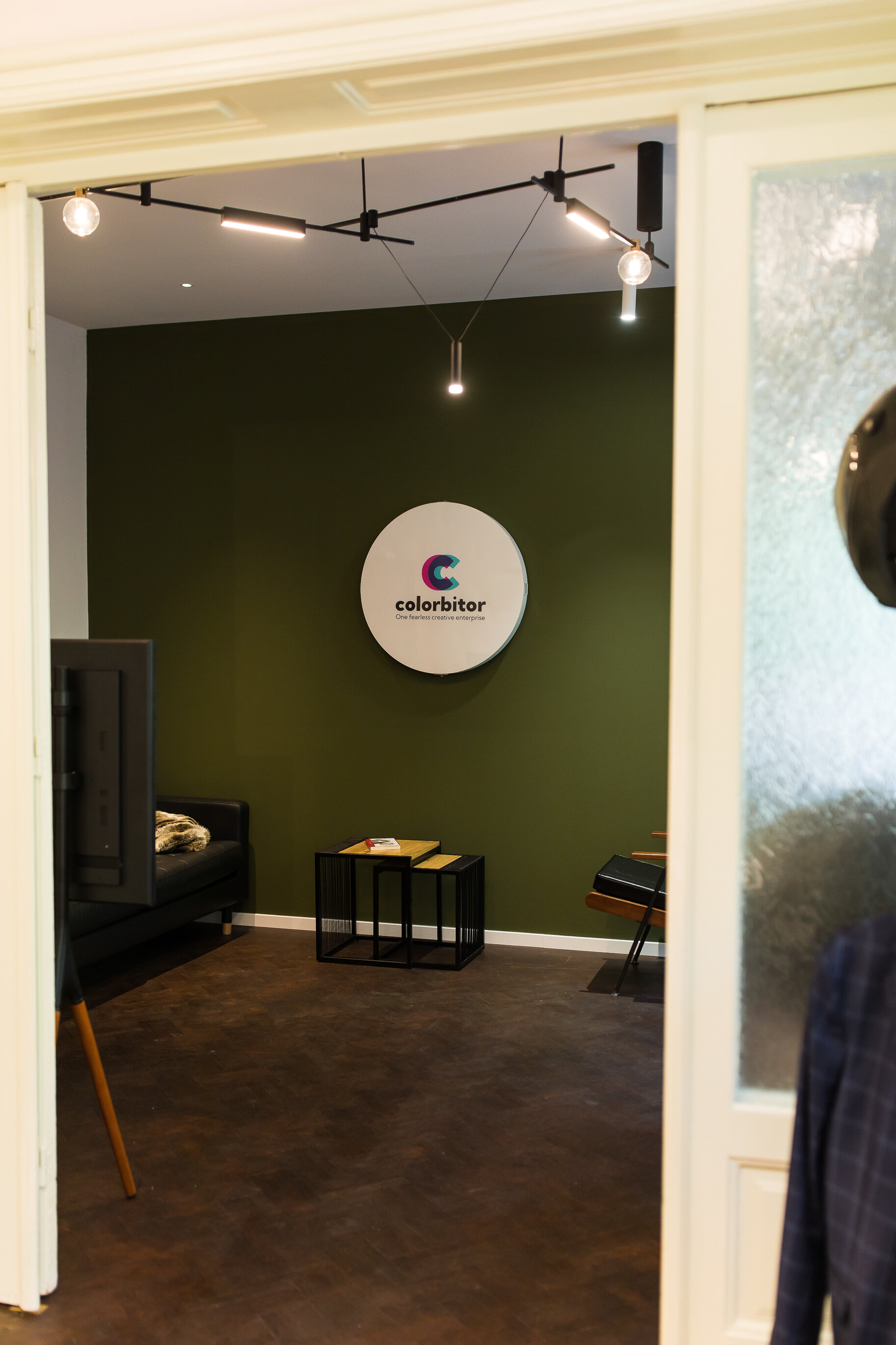
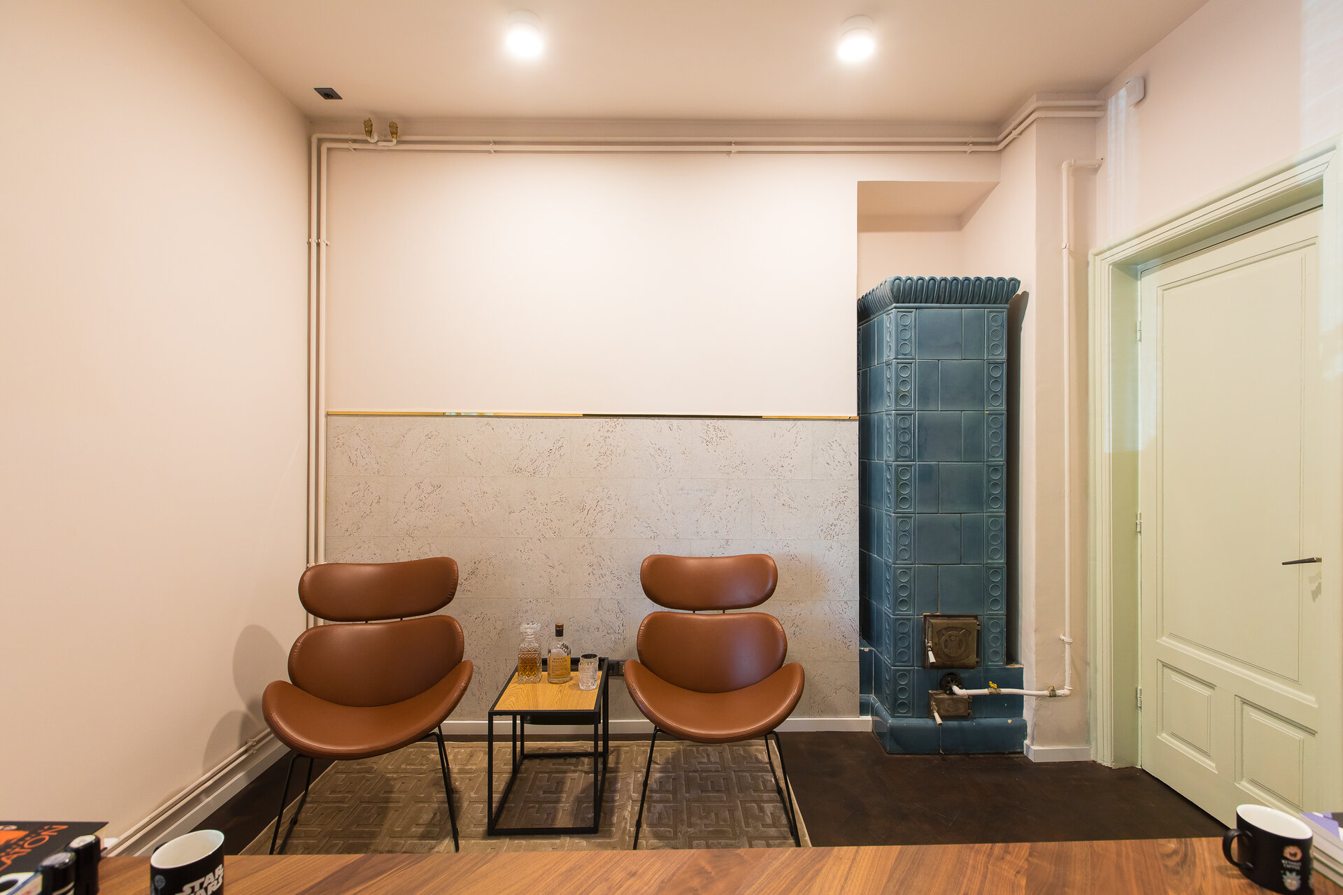
The reception space was a challenge due to the multitude of routes that cross it. We placed the desk in the most visible area for visitors. We proposed an accent object, with a rounded corner plated with a decorative cork texture. The relaxation area naturally got the quietest corner, behind which we placed the accent element of the room, the decorative wall with the logo. The pieces of furniture chosen are timeless, offering a first indication of the professional vibe desired by the clients.
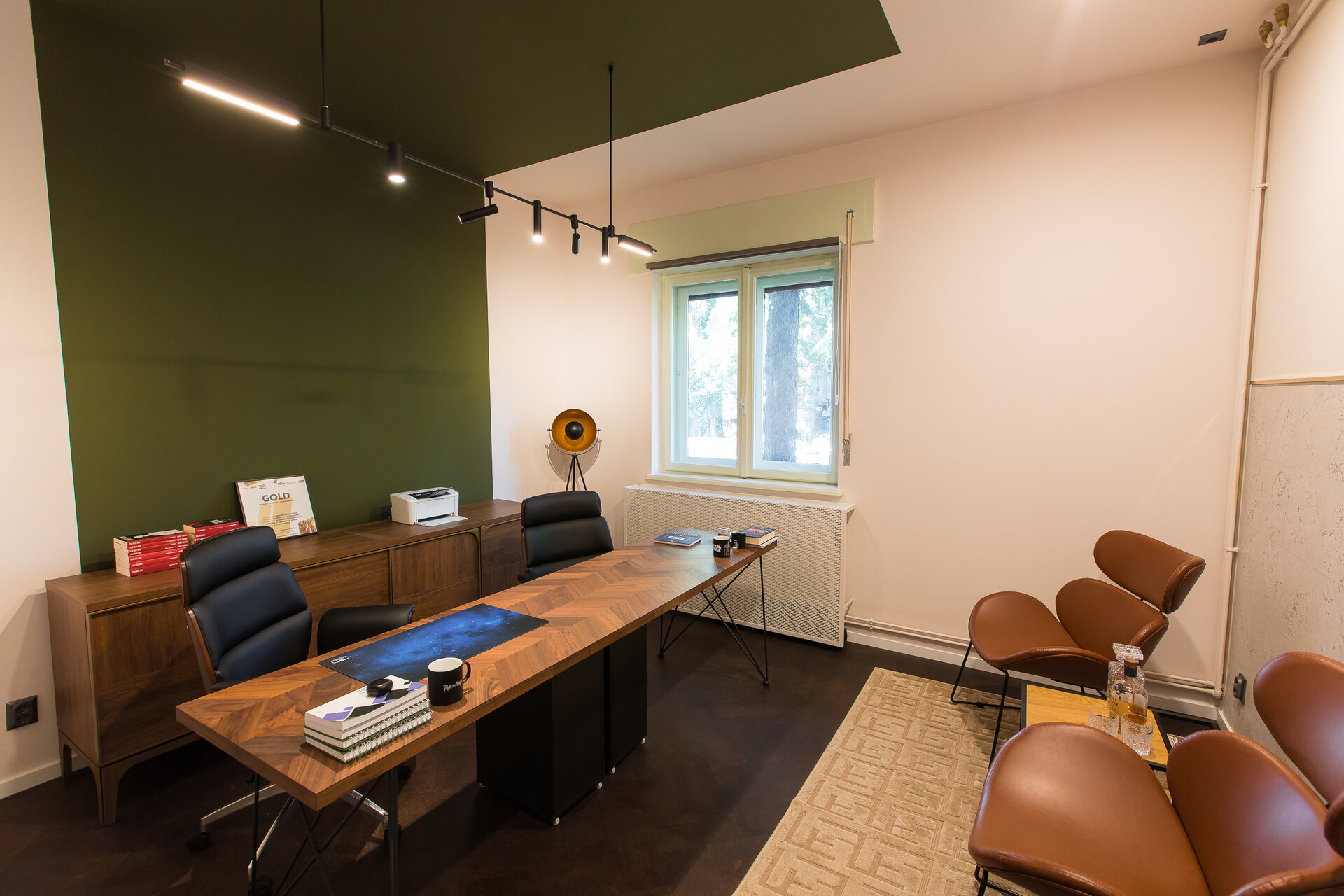
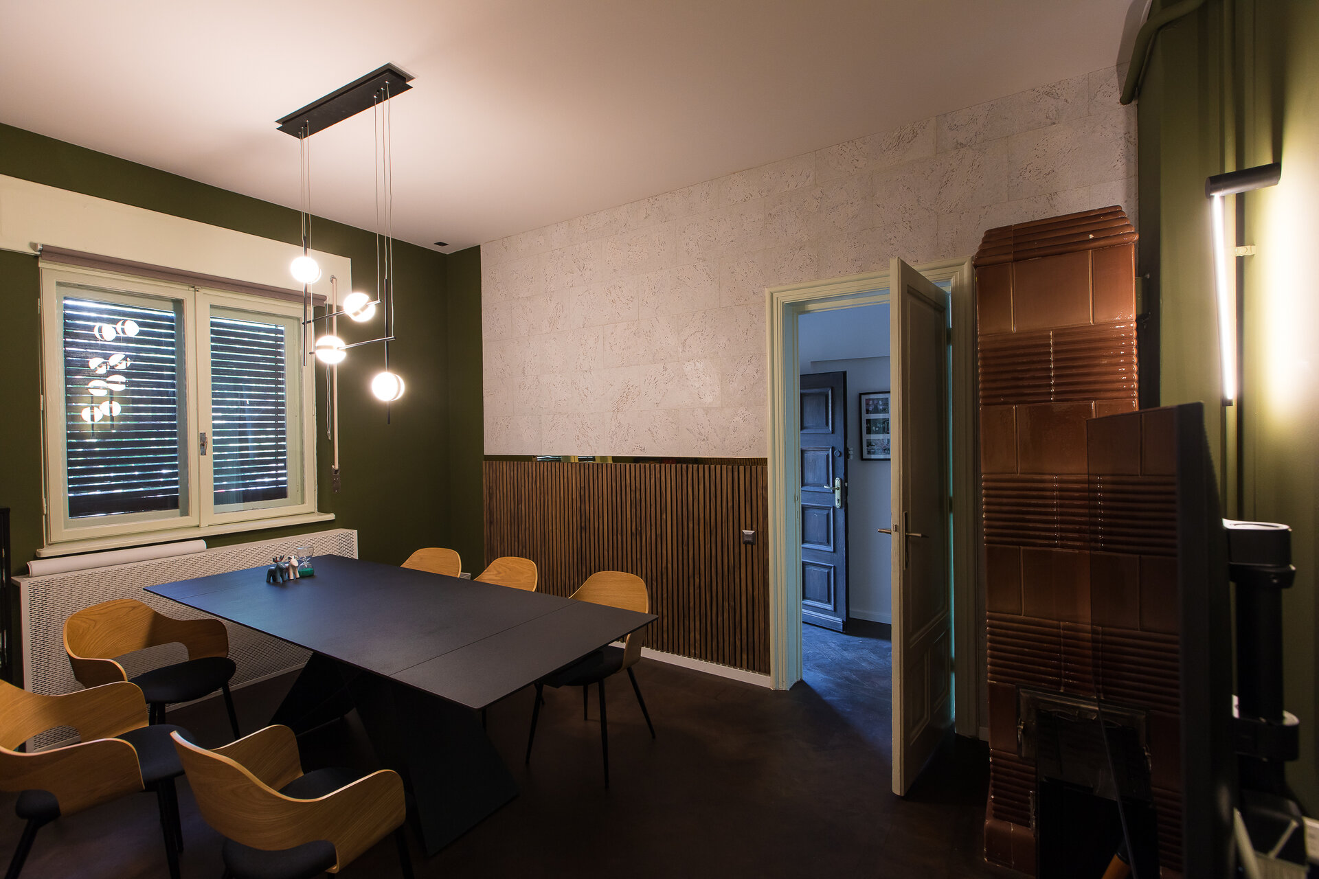
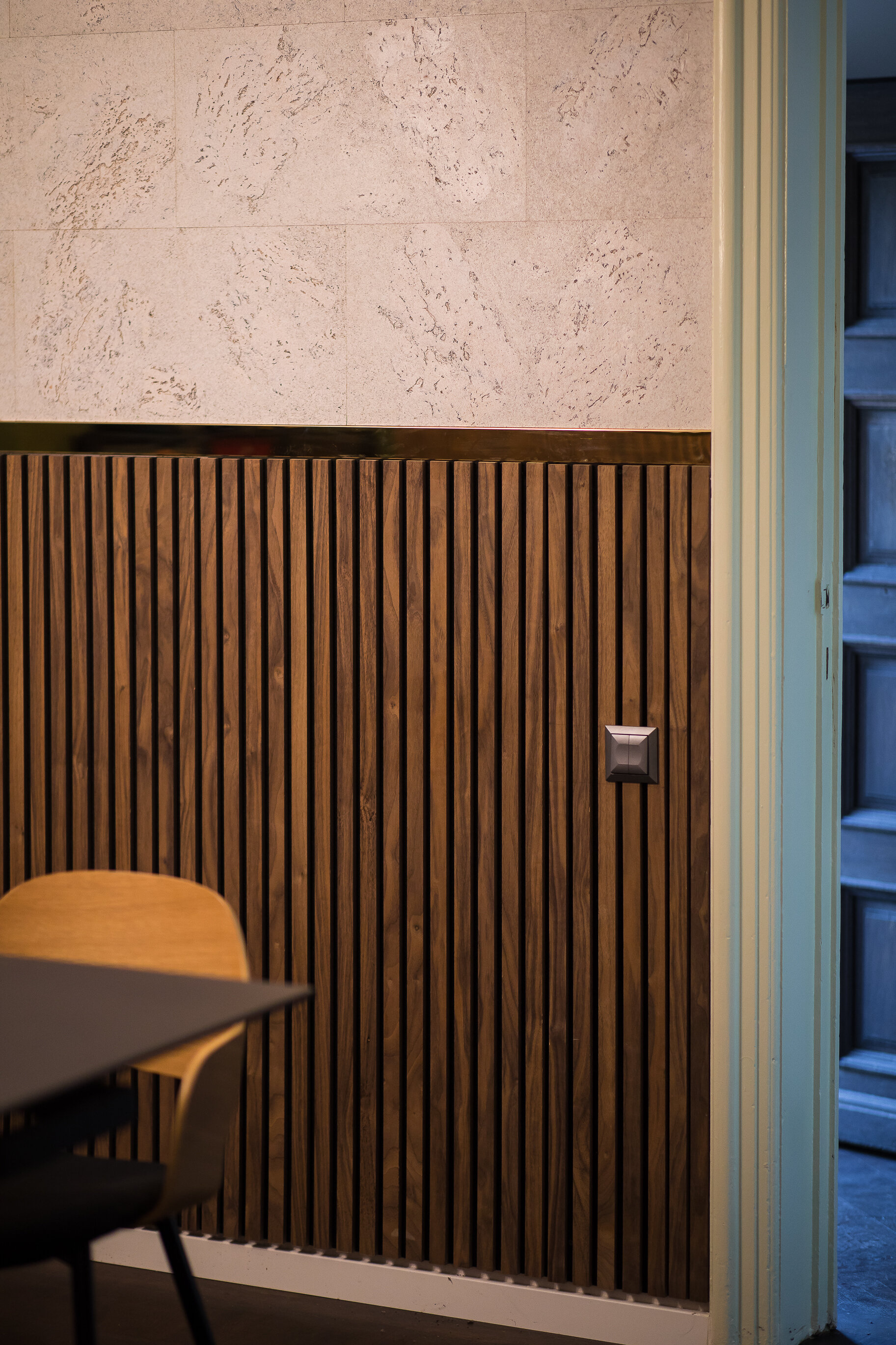
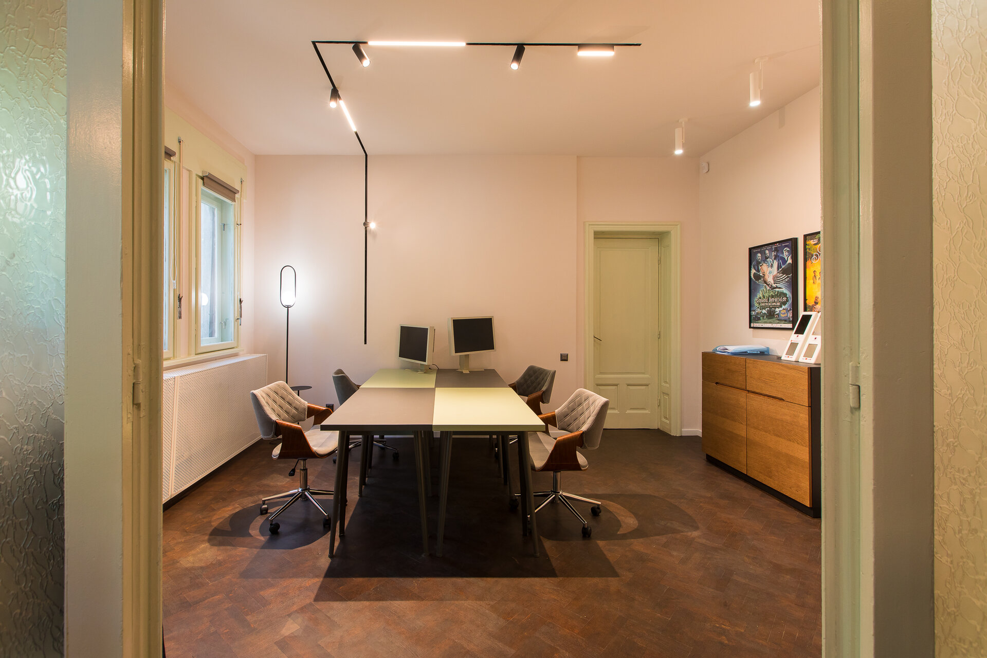
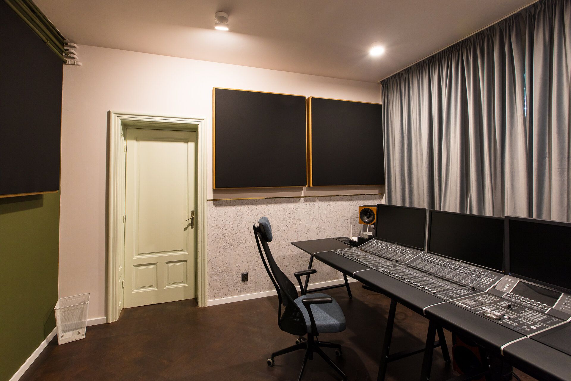
A challenge of the partners office was to position the 2 desks so that they both occupy the most favorable place for interaction with visitors. Although it reduced their personal space, this layout facilitates the view towards all entrances. We placed the desks one next to another, on a dark accent background and used a suspended lighting fixture. On the opposite side we proposed a relaxation corner with decorative finishes next to the existing ceramic stove. In the case of the meeting room, we used a symmetrical layout for the space, along the axis of the window. We wanted to accentuate it by using the same classic composition of finishes on the opposite walls, creating a median register marked by a gold line. We used a solid base base, a modern reinterpretation of wainscoting through ribbed wood panels, followed by cork, a warm texture meant to balance the intense hues.
Corporate and Retail Space Design
- OTOTO Victoriei
- ALTRNTV
- Skywind Group Offices
- Irina Schrotter retail shop
- Funcom Games Bucharest office fit out
- DayVet
- Yuno Clinic – Pediatric Centre
- The historic salons of the Mița Biciclista House
- ANV_RO
- Discovery Arena
- Neoclinique
- Skytower Lobby
- Ogre Offices
- Interior design office space PEP
- Tree office
- Gym K1
- Office design for a Global Leader in Live Dealer Gaming: a winning Game!
- KRUK România Headquarters
- CMS România Headquarters
- SIF Imobiliare Business Lounge
- Townhall Registration Office District 6 - Cora Lujerului
- Neakaisa.ro showroom. The gallery of Romanian bathroom design
- KPMG Romania
- Le Manoir
- McCann Romania
- HEI & Rompetrol
- Sameday Office Interior Design
- DKV Office Interior Design
- Interior design for reception and office Work&Travel Club
- Byonic Logistic Office
- Oracle office
- AECOM Office Interior Design
- Wirtek + ProMark Office Space
- EH Upgrade
- F64
- Yunity Reception
- Dermatology Clinic
- Northo Clinic
- Beautik Perfume Shop
- Colorbitor Office
- Tesla Group Headquarters
- BT Stup Offices
- Clinic Interior Design
