- Prize of the “Interior Space Architecture / Corporate and Retail Space Design” section
Carturesti Verso
Authors’ Comment
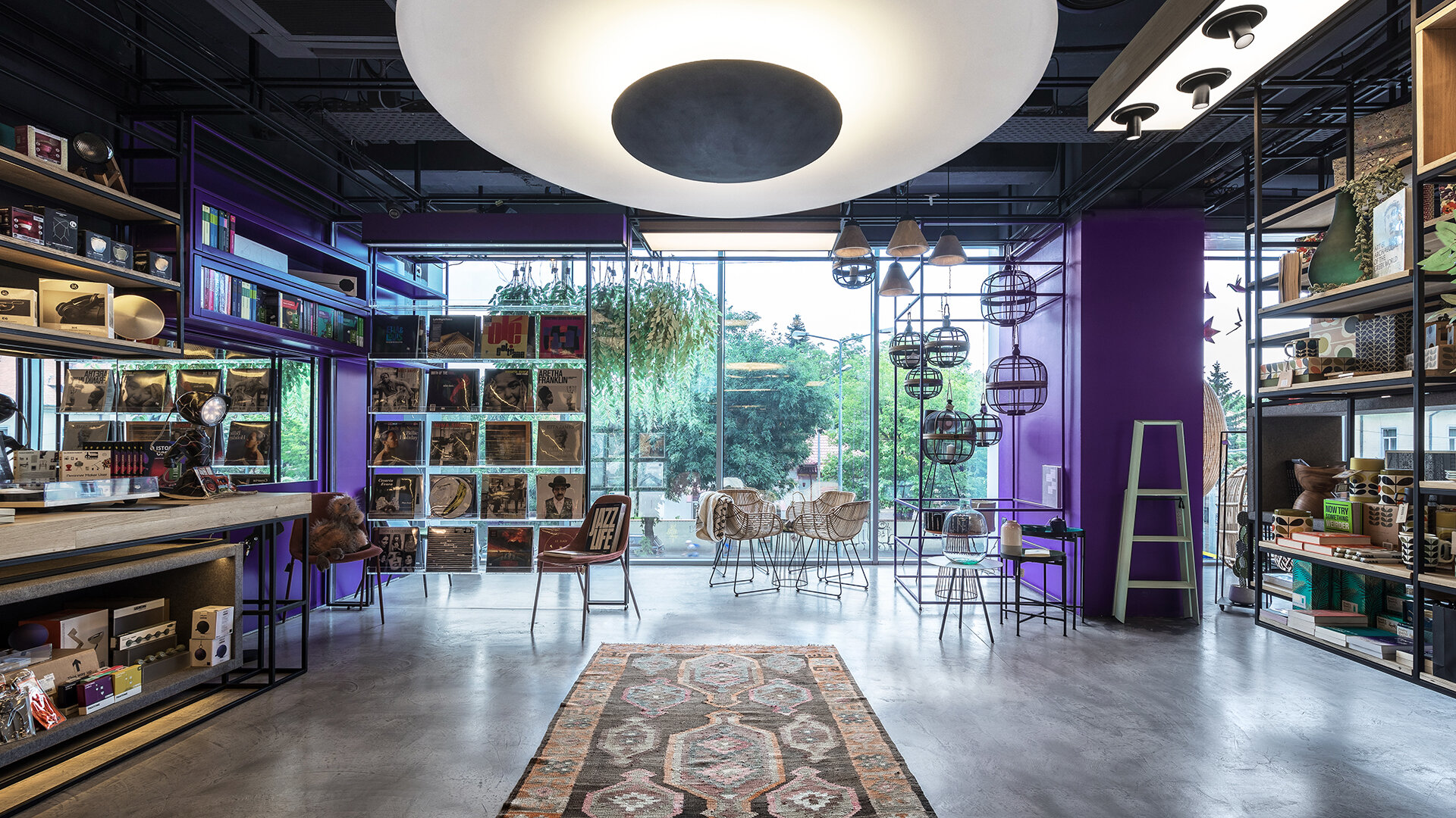
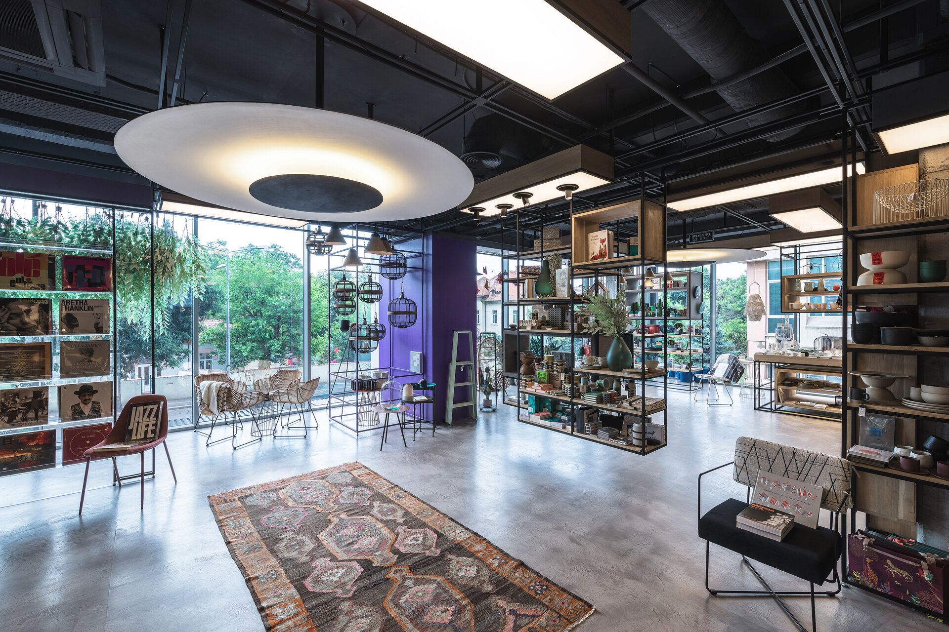
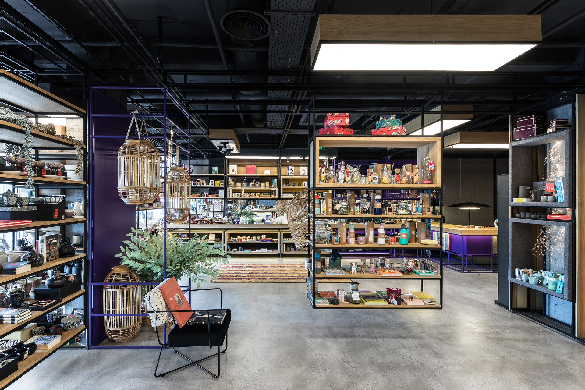
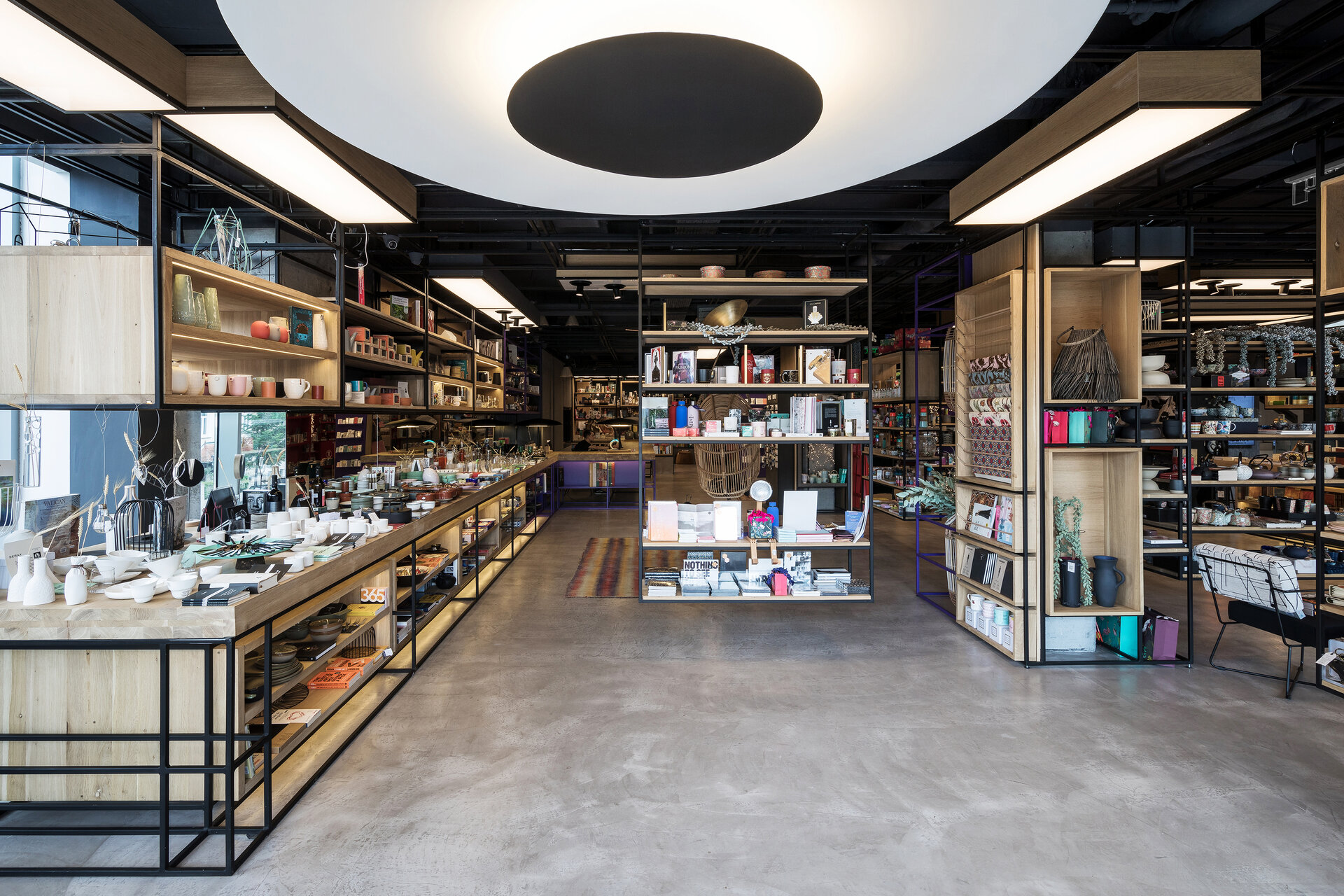
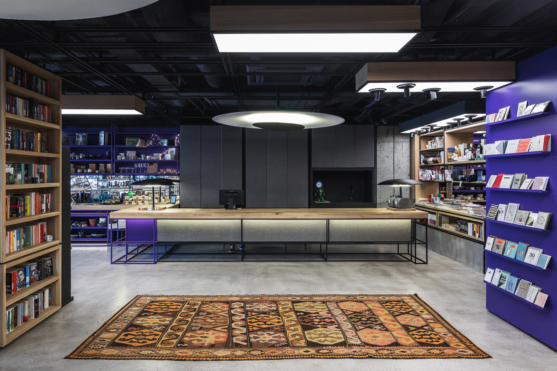
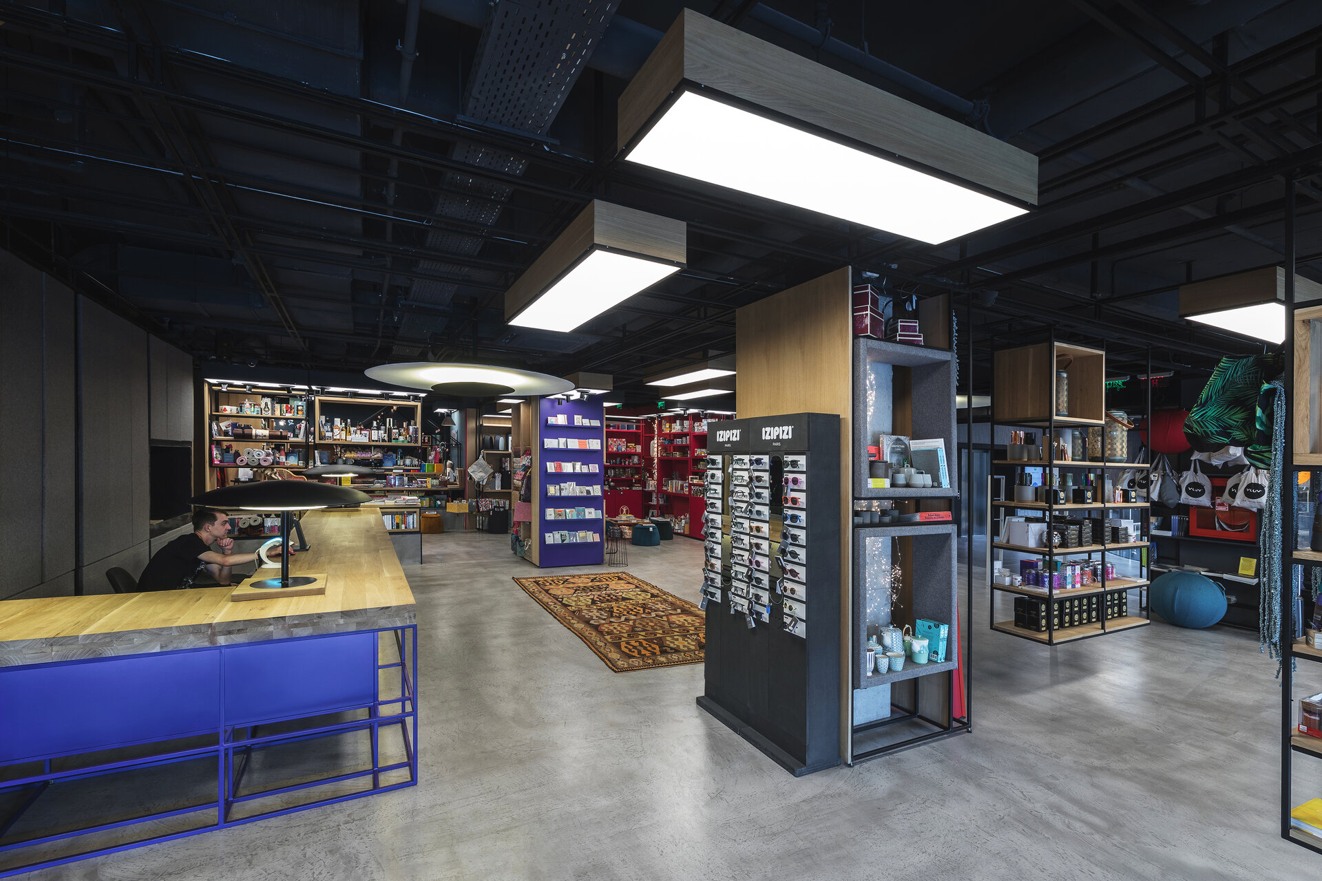
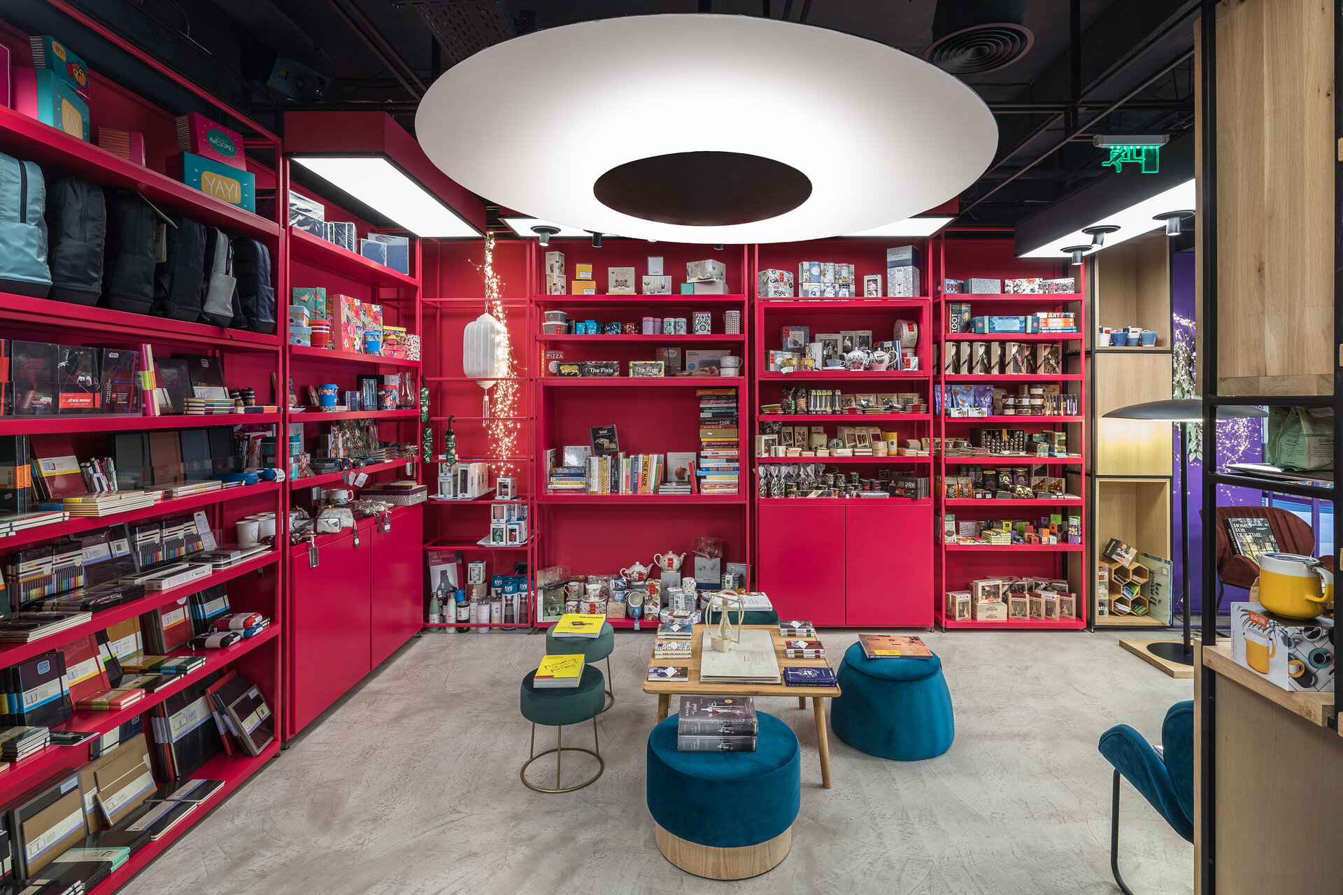
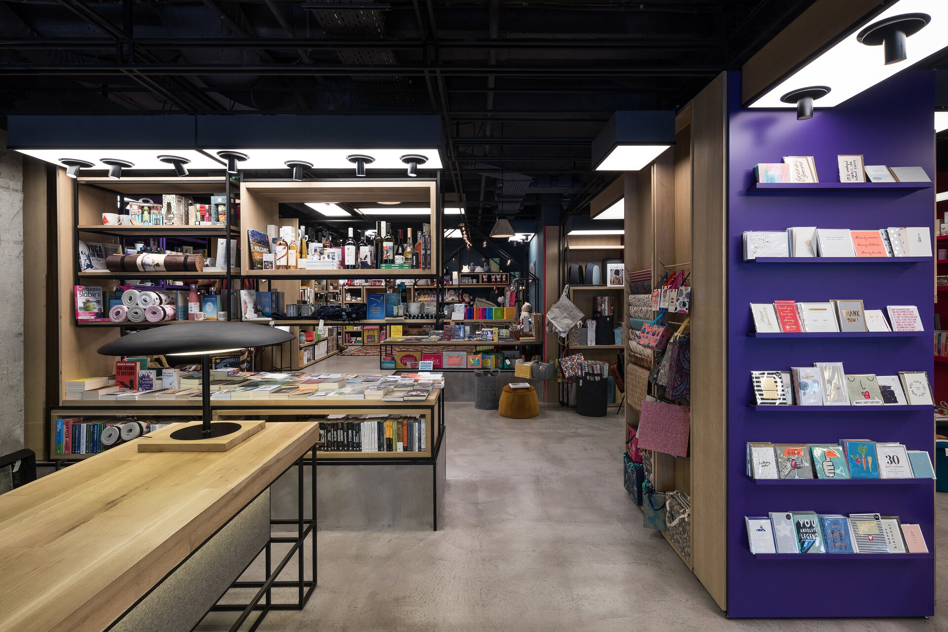
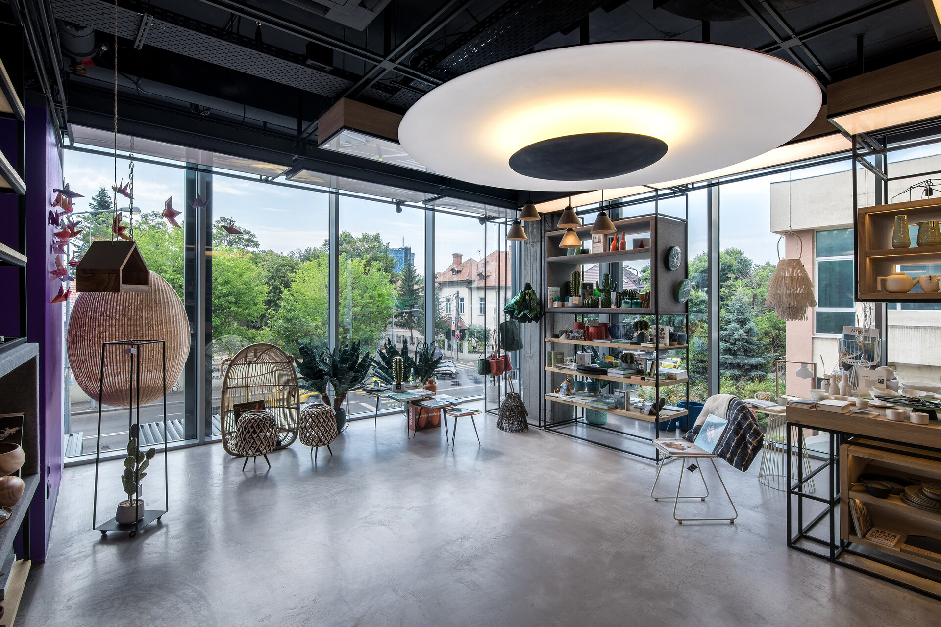
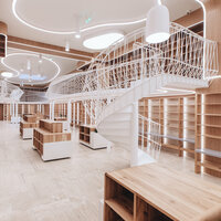
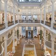
In the Verso project, the space was a challenge, being a mix between a street space and one in a shopping center. Having a fully glazed side and a fairly long window to the atrium, the space receives natural light from two directions. We tried not to obscure natural light as much as possible, to make it as perceptible as possible from any angle of space. This and the creative brief worked closely with the client led to the drawing of the concept very different from the rest of the Carturesti spaces. The range of products in this store is very different from the rest of the Carturesti bookstores, one of the peculiarities being the unique objects or those that need to be visible from all directions or as little obturated as possible. We tried to find variants of non-obtrusive central exposure. Regarding the floor, we chose a semi-gloss textured microcement, meant to help the propagation of natural light and the perception of the glazed area from various angles of space. So we decided that all central exposure bodies should be suspended from the ceiling and not obturated. Practically the whole arrangement is a network of metal frames that form boxes in which the products are displayed on solid wood shelves. This principle of furnishing the space and the way the floor reacts to the light allowed us to obtain an effect of continuity of the space, although an extremely wide range of very different products had to be exposed. In order to tame the industrial visual effect of the metal frames on the background of the apparently left concrete, and to facilitate the orientation in space, we used wood cladding, with various finishes, from natural wood, to MDF painted polyurethane in vivid colors, panel cladding wood finishes with natural wool felt, up to mirror cladding for a better highlighting of the products on display. Another peculiarity is represented by the different perimeter exposure mode, by creating a continuous exposure surface, of solid wood countertop type, with a width of 80 cm, on the two long sides of the space. All the lighting was designed, calculated and made to order, it is practically custom made, being a mix of directional lighting, diffused light and indirect ambient light. In all hypostases we used warm light in contrast to neutral natural light. The light was designed so that the entire space (even the spaces between the shelves) to contain and emit light without overshadowing the space, because we wanted to create a more intimate atmosphere. for the visitor or the buyer to be both curious and visually stimulated but to feel comfortable In my opinion, for a retail space to be successful, it must, in addition to the functional ease of the acquisition process, offer a memorable environmental experience, so the clientele to return, not only for the acquisition but also for the experience offered, the respective space.
Jury Comments
Excellent and balanced choice and combination of materials and colors. It is not easy to work with color and achieve a consistent and strong result. Careful and intelligent design of how to expose a considerable number of objects. We must emphasize the balanced and careful way in which the project works with natural and artificial lighting.
Related projects:
Corporate and Retail Space Design
- Carturesti Verso
- SSAB Flagship Store
- Skin Media Office
- Carturesti Operei
- Diverta Cluj
- Diverta Craiova
- Off cliché – office design
- Fresh Bazar
- Braiconf Store, Bucharest Mall
- WPP Group Office Fit-out
- Upgrade Cotroceni Market
- ROCA Shop
- Solarwinds offices
- Prographic Office
- Pay U Offices
- Statera – The science of beauty
- A.T. Kearney Offices
- Bitdefender Offices
- Huawei Offices
- Anne Bebe
- Kiss FM Offices
- Molson Coors Offices
- Alura
- Nordic Offices
- Sweat Concept Fitness (1-3)
- Techo Showroom
- Water Air Nature Office
- Thales Offices
- ROMAERO design
- Zitec Offices
- aSpace Floreasca Hub
- Office interior design Intesa SanPaolo Bank
- Dr. Leahu Dental Clinics Oradea
- Crosspoint Real Estate Office Design
- Accenture Offices – Bucharest
- P&S Offices
- Flower-shop IRIS Dorobanți
- Kinetic Sport & Medicine
- New office space for Ceetrus Romania
- Klass Wagen Office
- Pediatric Clinic – Regina Maria – The Light
- Riverbed Technology
- aSpace By Lido Hub
- „SEVDA Diamonds” interior design
- Bonteria Very&So
