Diverta Cluj
Authors’ Comment
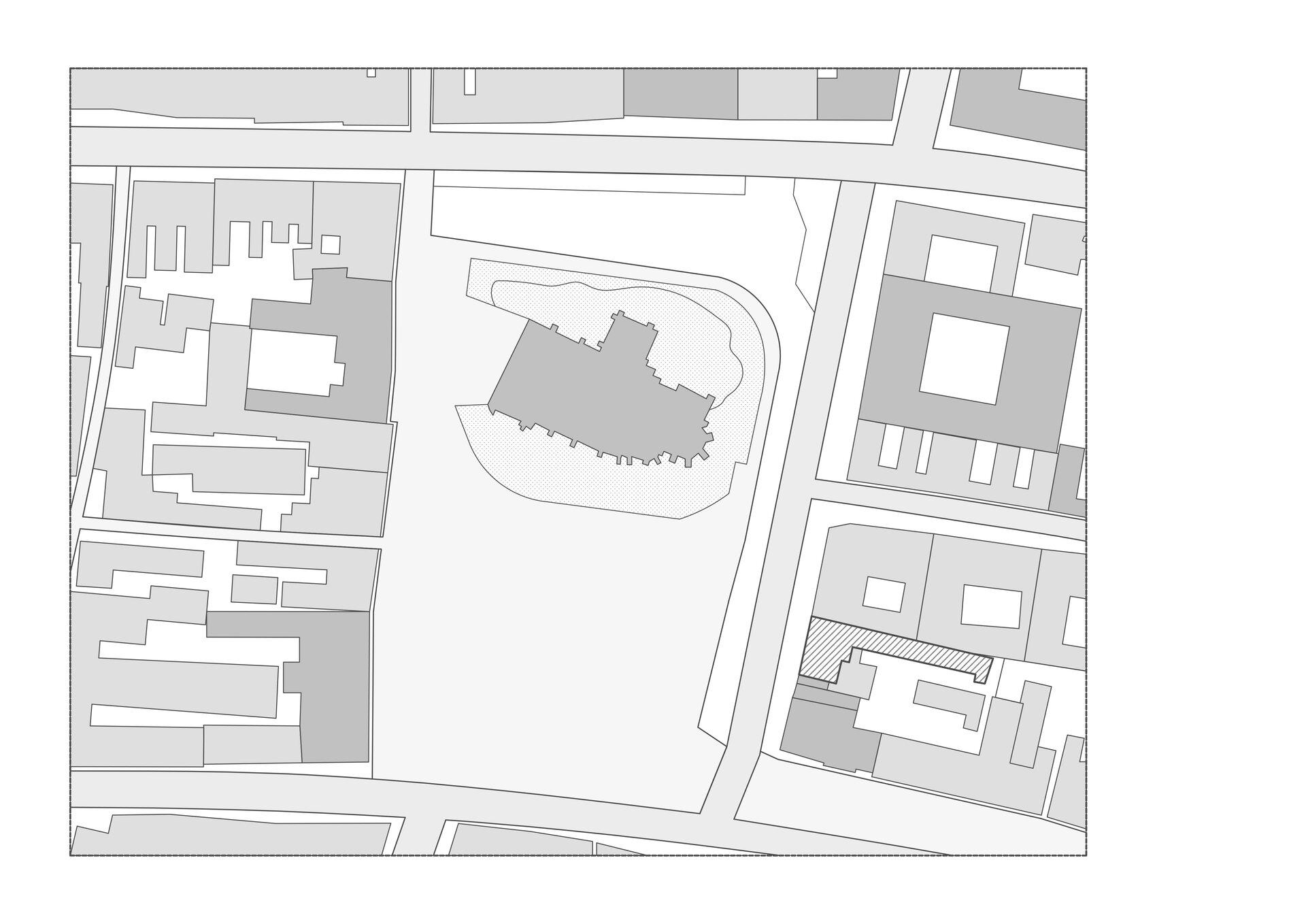
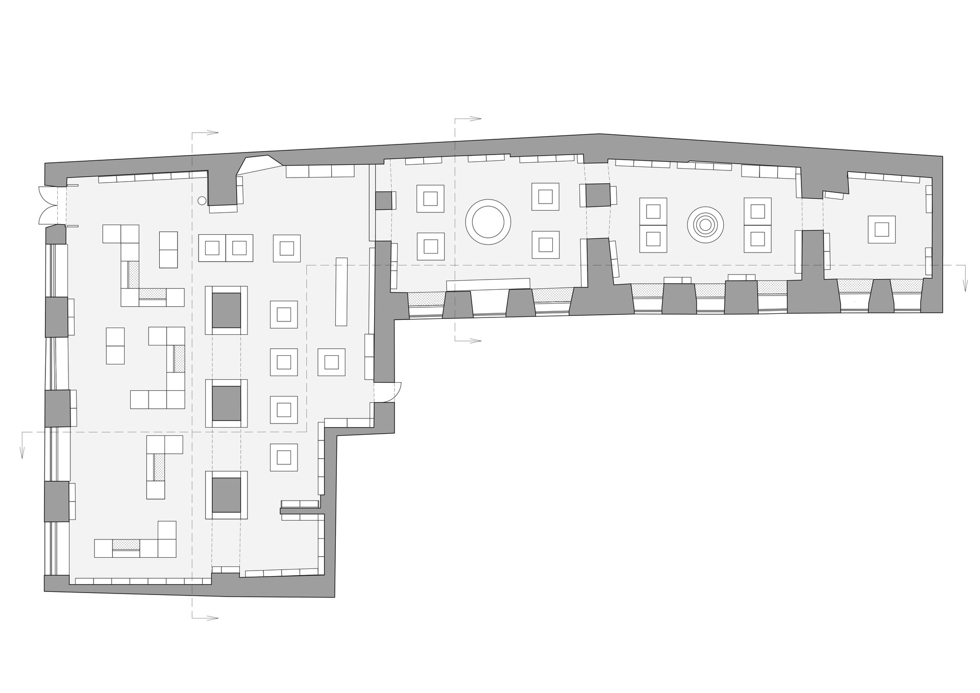
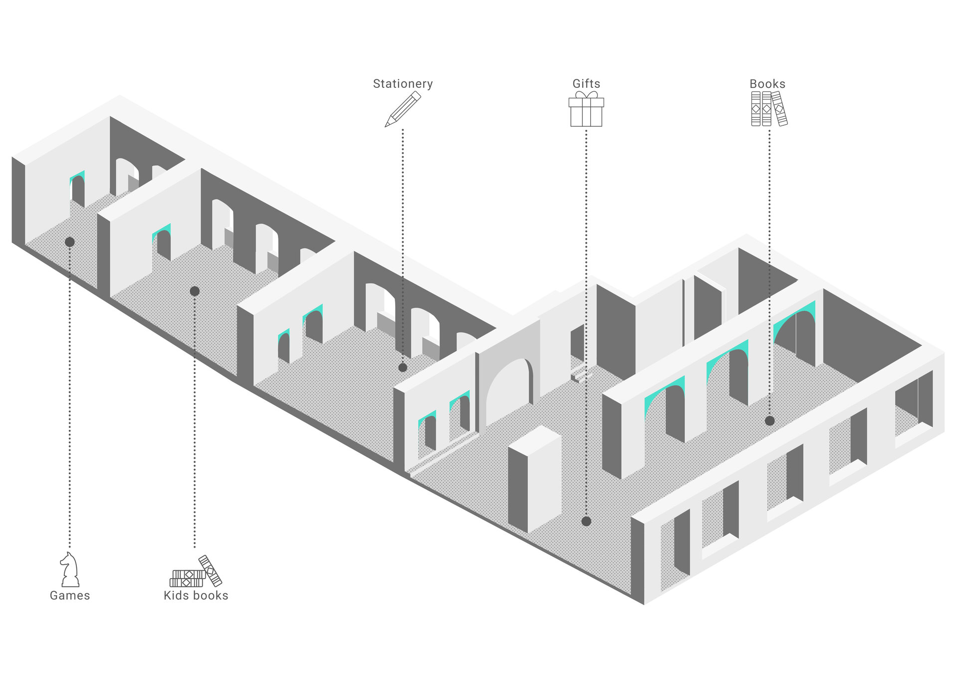
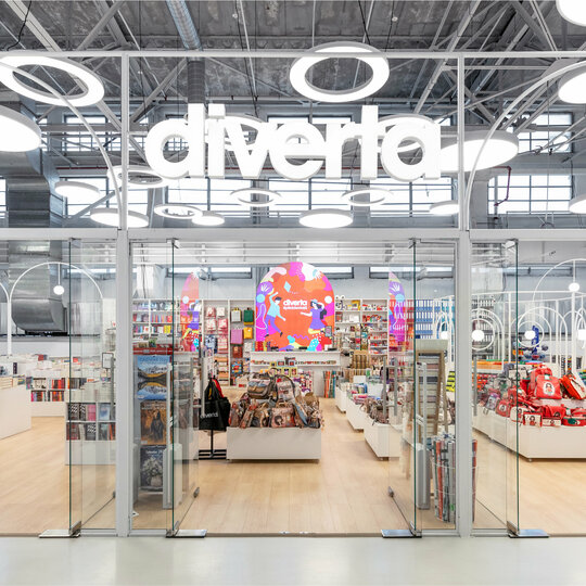
The Diverta Cluj concept was entirely inspired by the location – The Wolphard-Kakas House, a beautiful historic building located in the eastern part of Union Square, in Cluj. The main challenge was to combine the two styles of the building - the historic area, Gothic, with strong broken vaults and a large contemporary cold space located at the entrance. The main need was to create a connection between these two spaces, highlighting the old area.
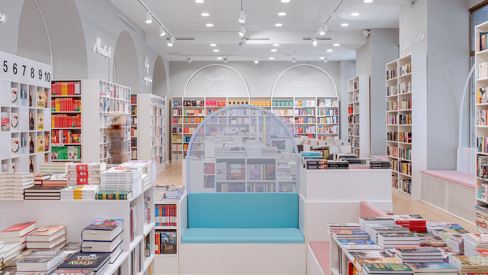
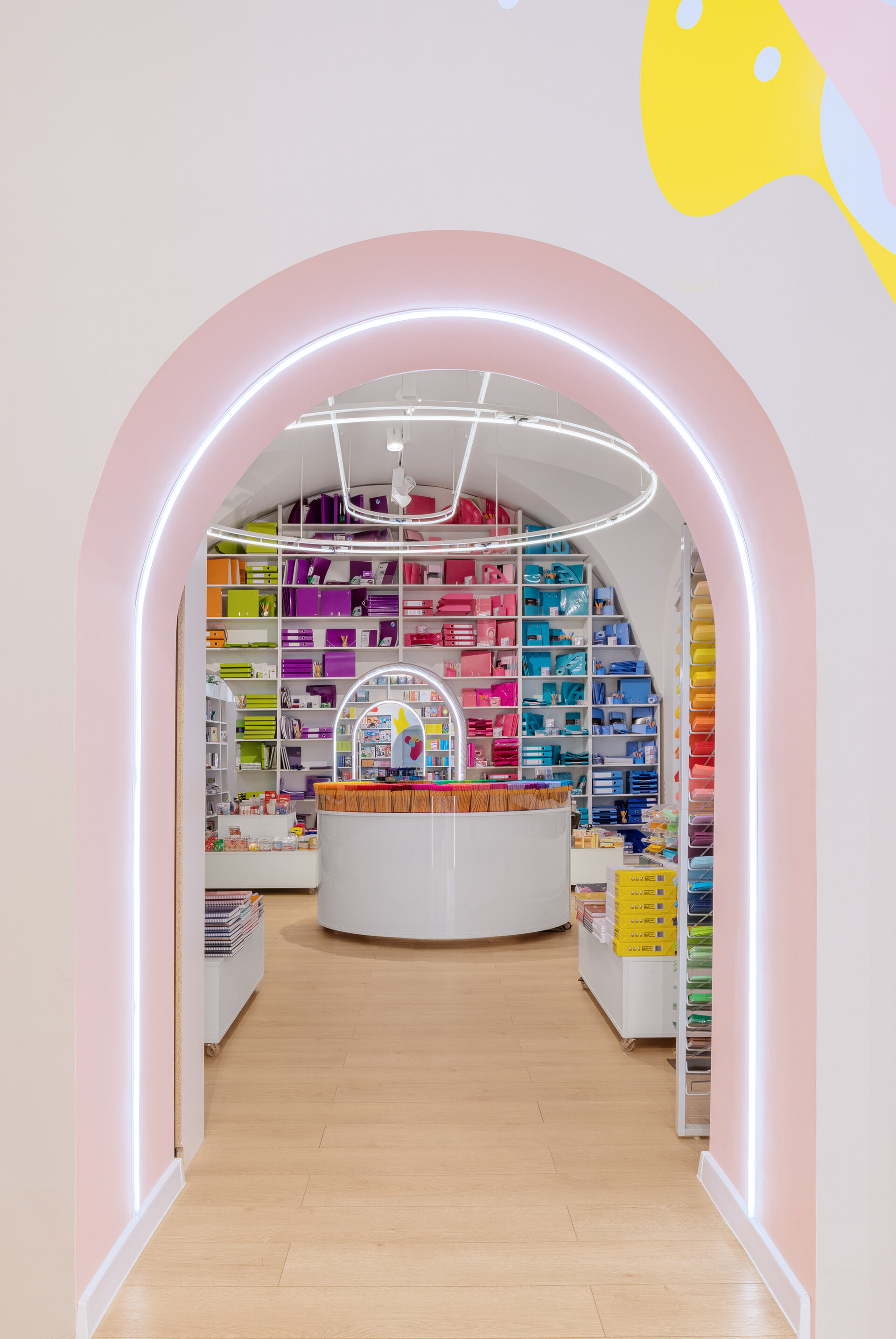
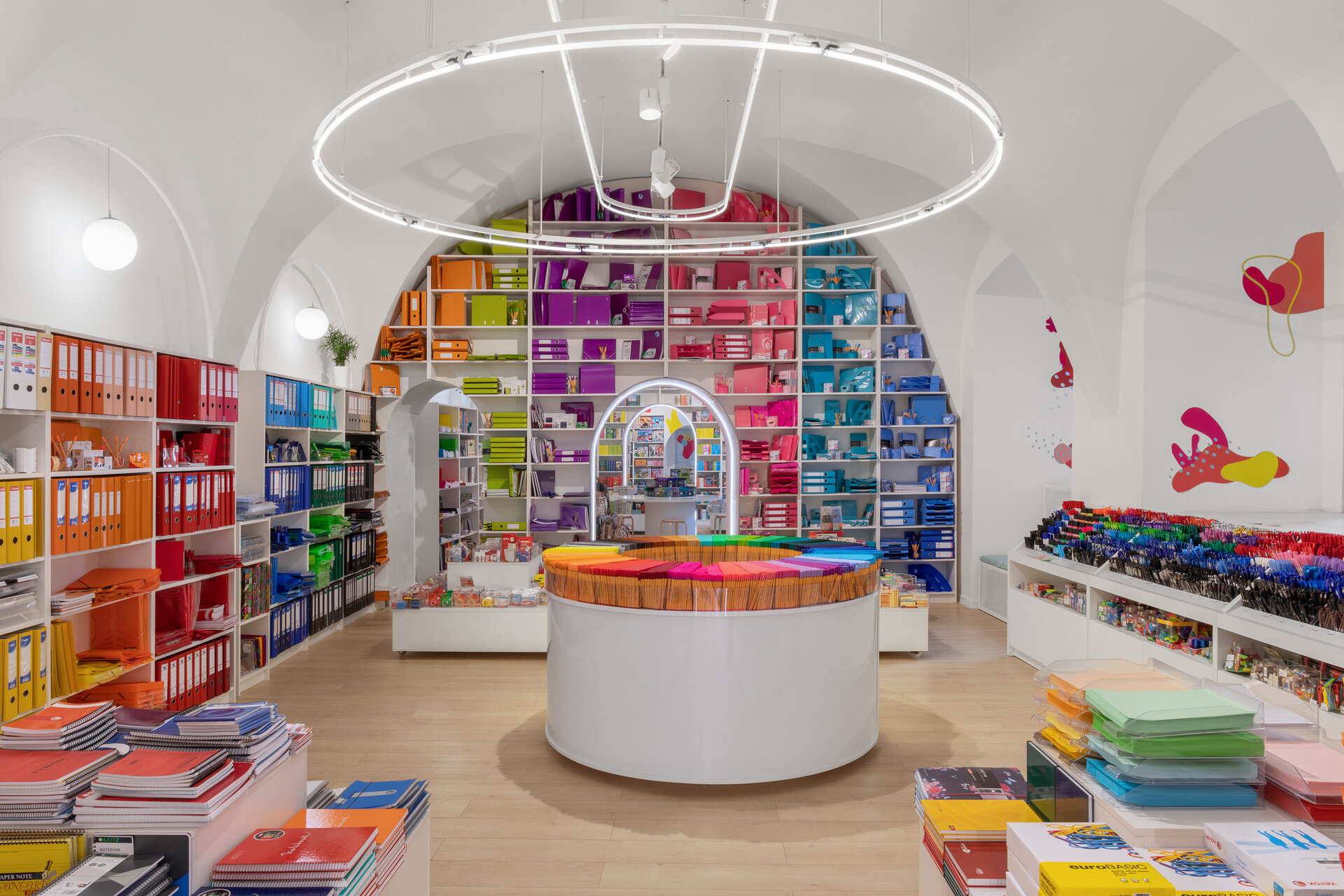
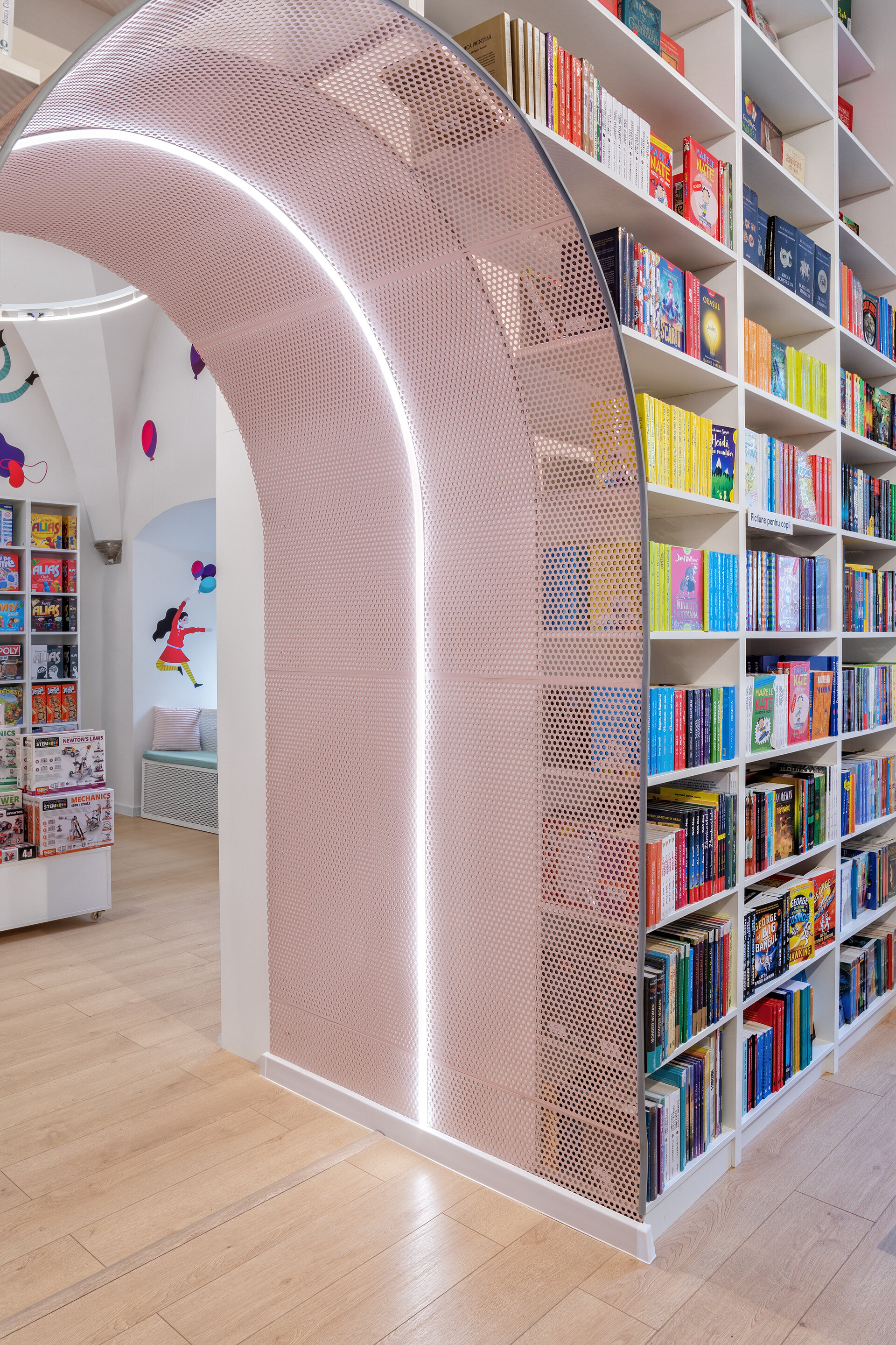
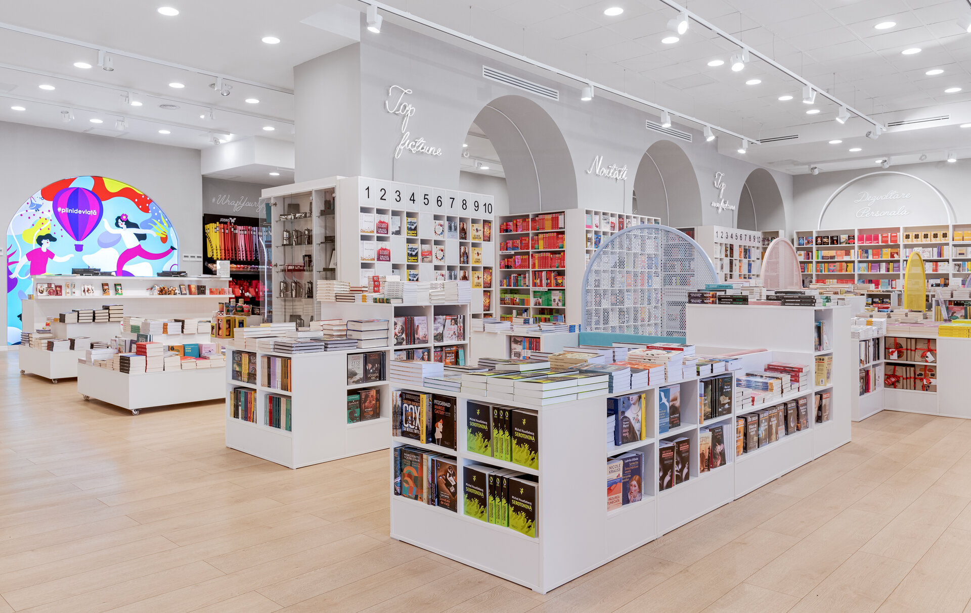
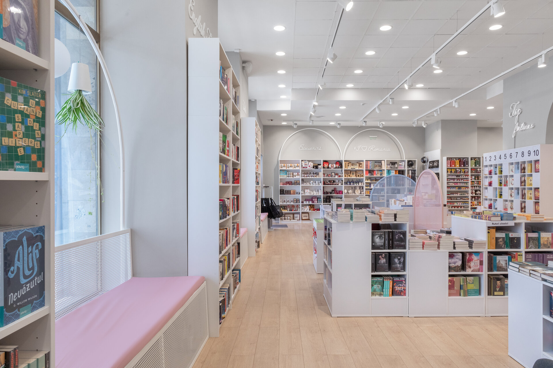
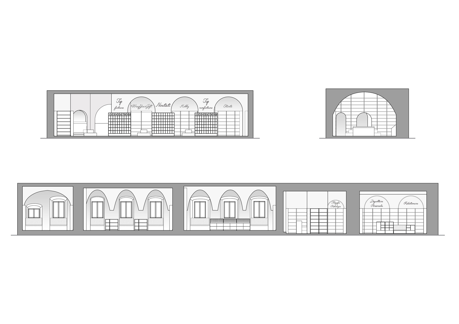
The arched vaults became the red thread of the arrangement, which we wanted to bring in the new part of the building, but in a different manner. Because we wanted the old area to still be very visible, we chose not to replicate these vaults and to use the simple arch as a new intervention, a simple shape that easily integrates into both architectural styles. The existing Gothic vaults remained visible through their uniqueness, while the arches used in the contemporary entrance area provide continuity to the entire space, making all the design elements harmonize and create a uniform concept.
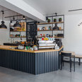
The main area at the entrance was considerably larger and disproportionate in surface than the small rooms in the historic part, which makes the space to be discovered gradually. In order to highlight the passage in the historical area of the building, we transformed the concentric passages and we accentuated this perspective by lining the passage arches with perforated sheet metal to emphasize the modern intervention. This texture is used both in the creation of the furniture and also on the benches that mark the reading or recreation areas.
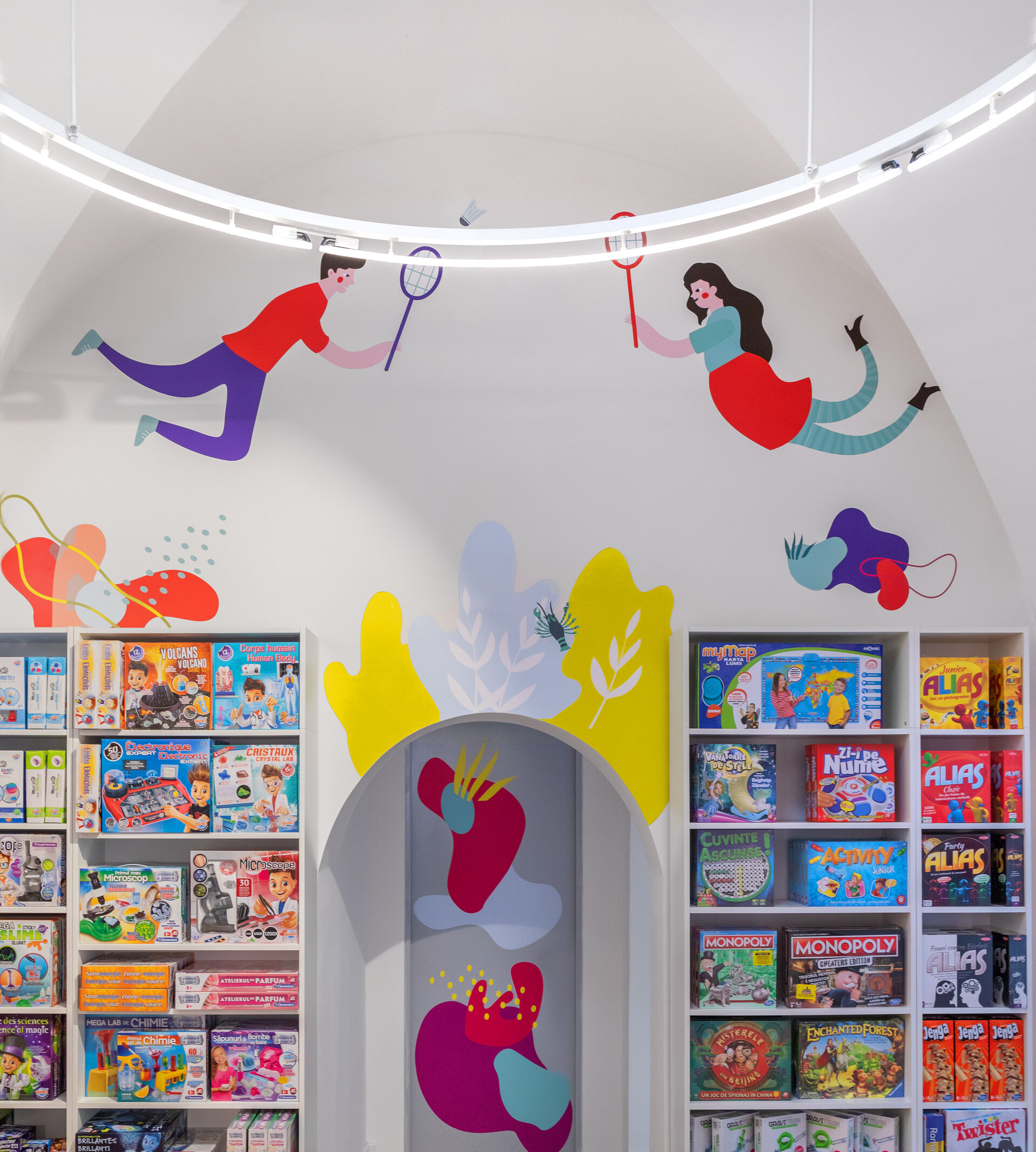
The lighting played an important role especially in the vaulted area where we opted for neon tube lights in the shape of a circle or elliptical of very large dimensions. This helped to improve the visibility of the ceilings.
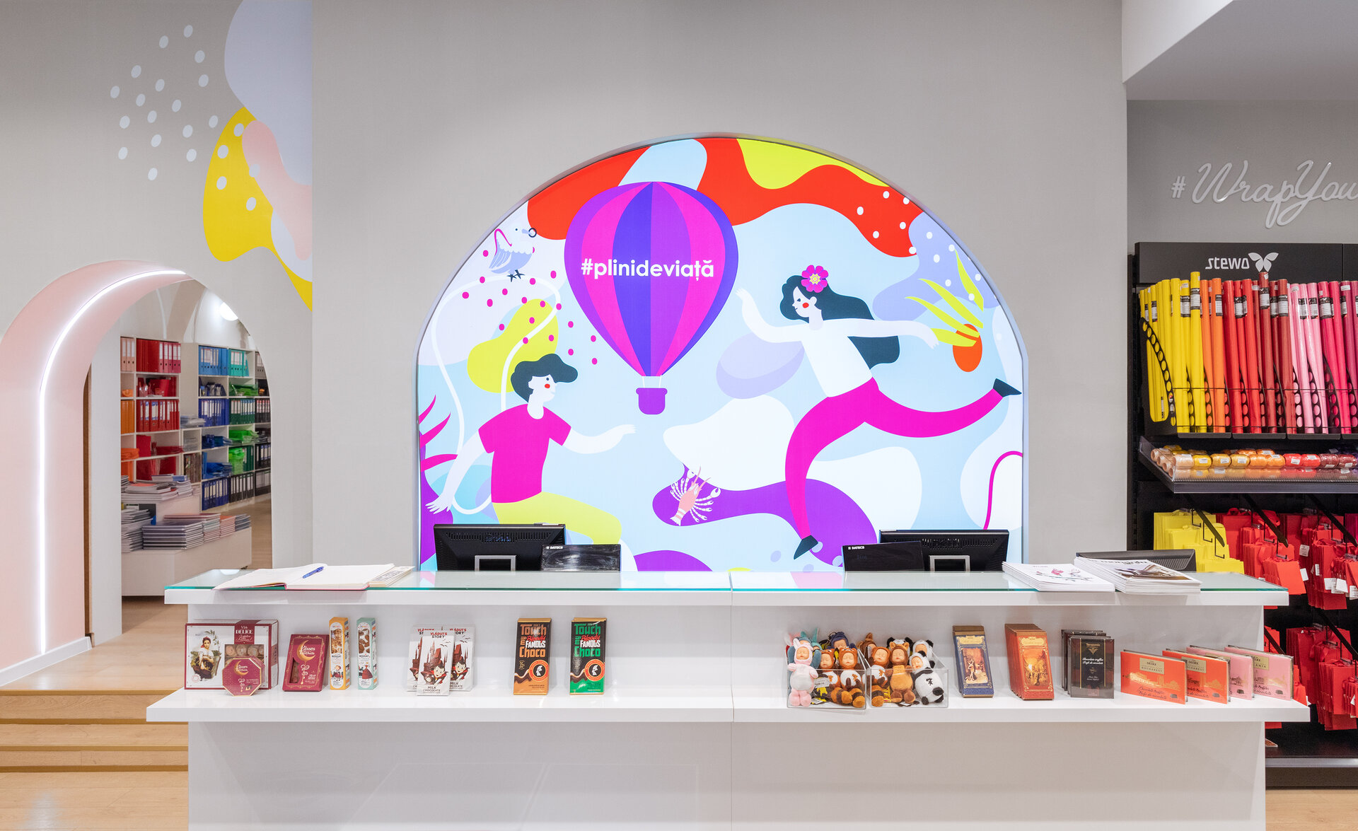
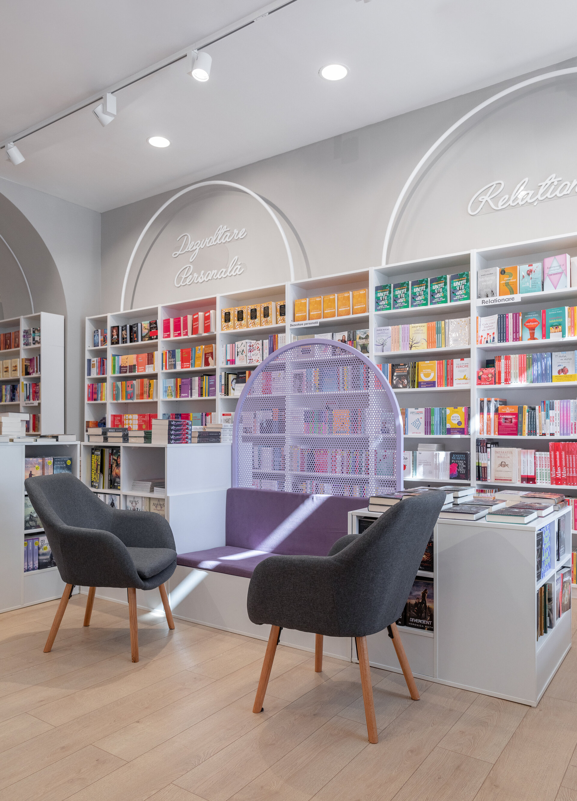
The use of the arch was found throughout the space, including the design of the furniture, where it was incorporated in various ways. The reading areas were marked with their help, the display shelves were continued at the top with the same shape that marks the location signs, and the cash register was highlighted by a generous backlit arcade with the new graphics of the Diverta brand. As a result, a strong architectural language has been established that can be found throughout the space.
The chromatics of the arrangement are subtle in shades of white and pastel colours to blend harmoniously with the graphics that the client wanted to integrate in the location, in the context of the new brand image developed by us during the collaboration and incorporated in most of their locations.

Related projects:

Corporate and Retail Space Design
- Carturesti Verso
- SSAB Flagship Store
- Skin Media Office
- Carturesti Operei
- Diverta Cluj
- Diverta Craiova
- Off cliché – office design
- Fresh Bazar
- Braiconf Store, Bucharest Mall
- WPP Group Office Fit-out
- Upgrade Cotroceni Market
- ROCA Shop
- Solarwinds offices
- Prographic Office
- Pay U Offices
- Statera – The science of beauty
- A.T. Kearney Offices
- Bitdefender Offices
- Huawei Offices
- Anne Bebe
- Kiss FM Offices
- Molson Coors Offices
- Alura
- Nordic Offices
- Sweat Concept Fitness (1-3)
- Techo Showroom
- Water Air Nature Office
- Thales Offices
- ROMAERO design
- Zitec Offices
- aSpace Floreasca Hub
- Office interior design Intesa SanPaolo Bank
- Dr. Leahu Dental Clinics Oradea
- Crosspoint Real Estate Office Design
- Accenture Offices – Bucharest
- P&S Offices
- Flower-shop IRIS Dorobanți
- Kinetic Sport & Medicine
- New office space for Ceetrus Romania
- Klass Wagen Office
- Pediatric Clinic – Regina Maria – The Light
- Riverbed Technology
- aSpace By Lido Hub
- „SEVDA Diamonds” interior design
- Bonteria Very&So
